Journal /
Artists
A poster tells you almost nothing about the person who made it. These pages are our attempt to fix that, one artist at a time. Not on this list yet? Tell us what you make.
Artist
Anna Ganna
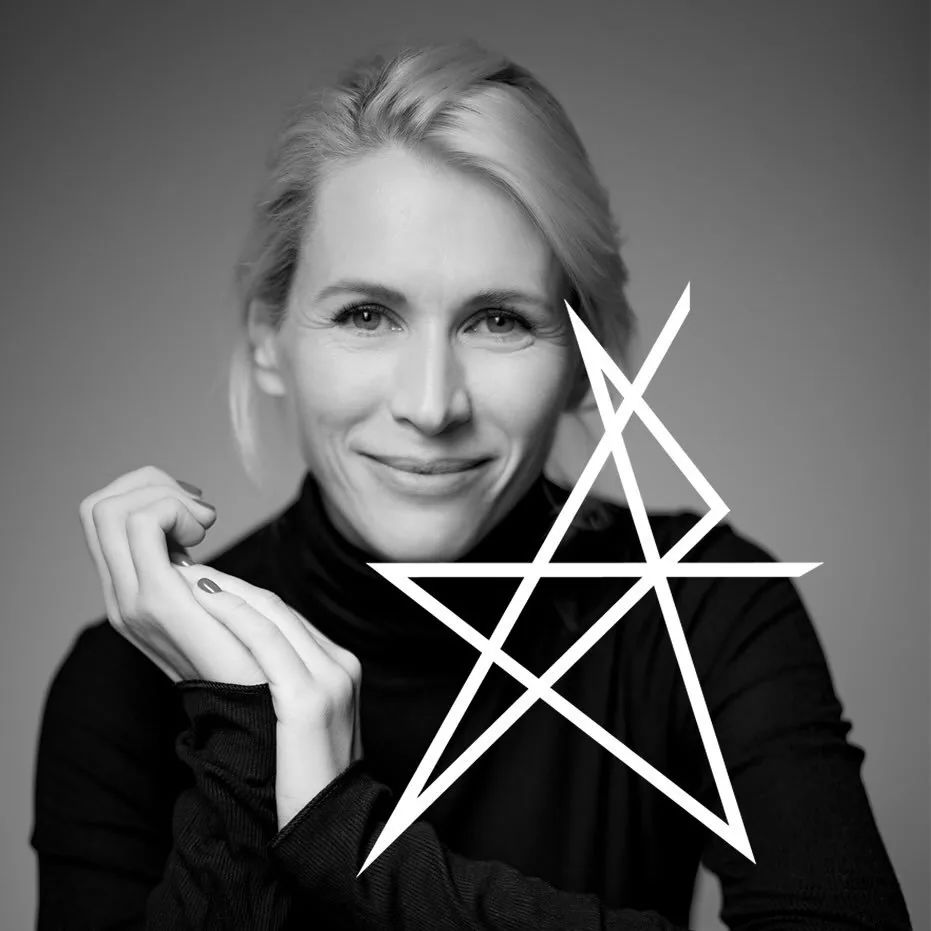
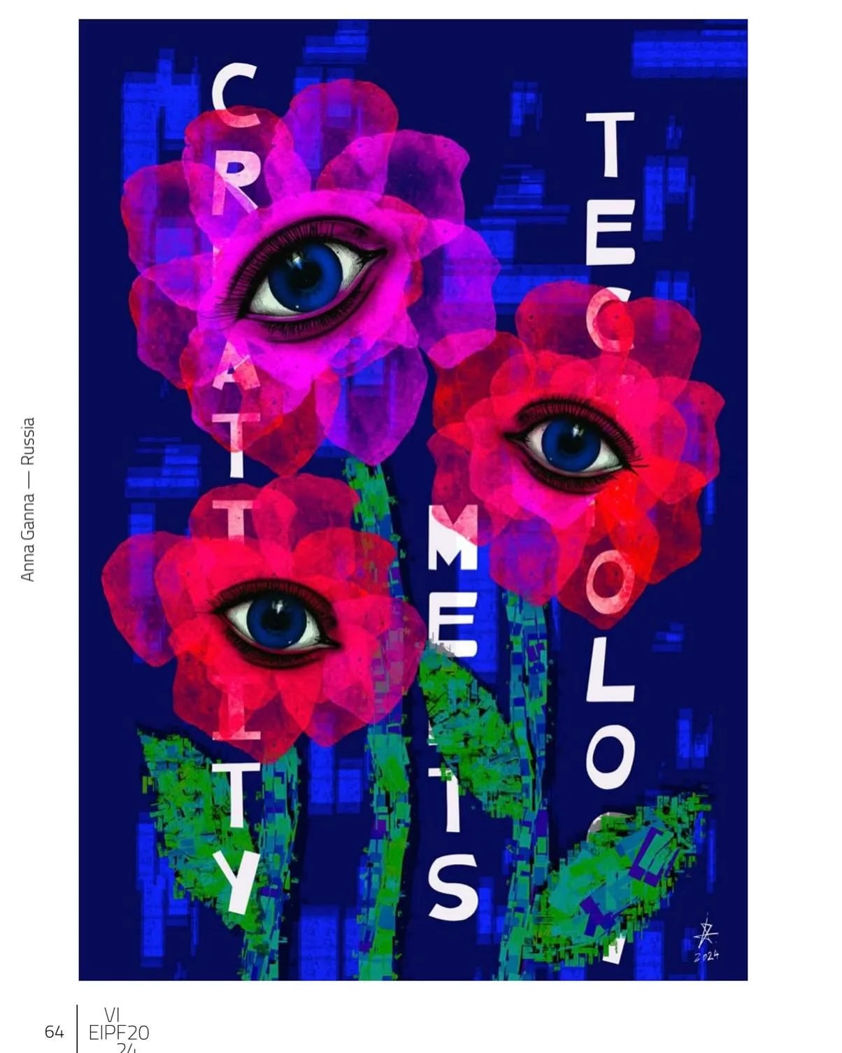
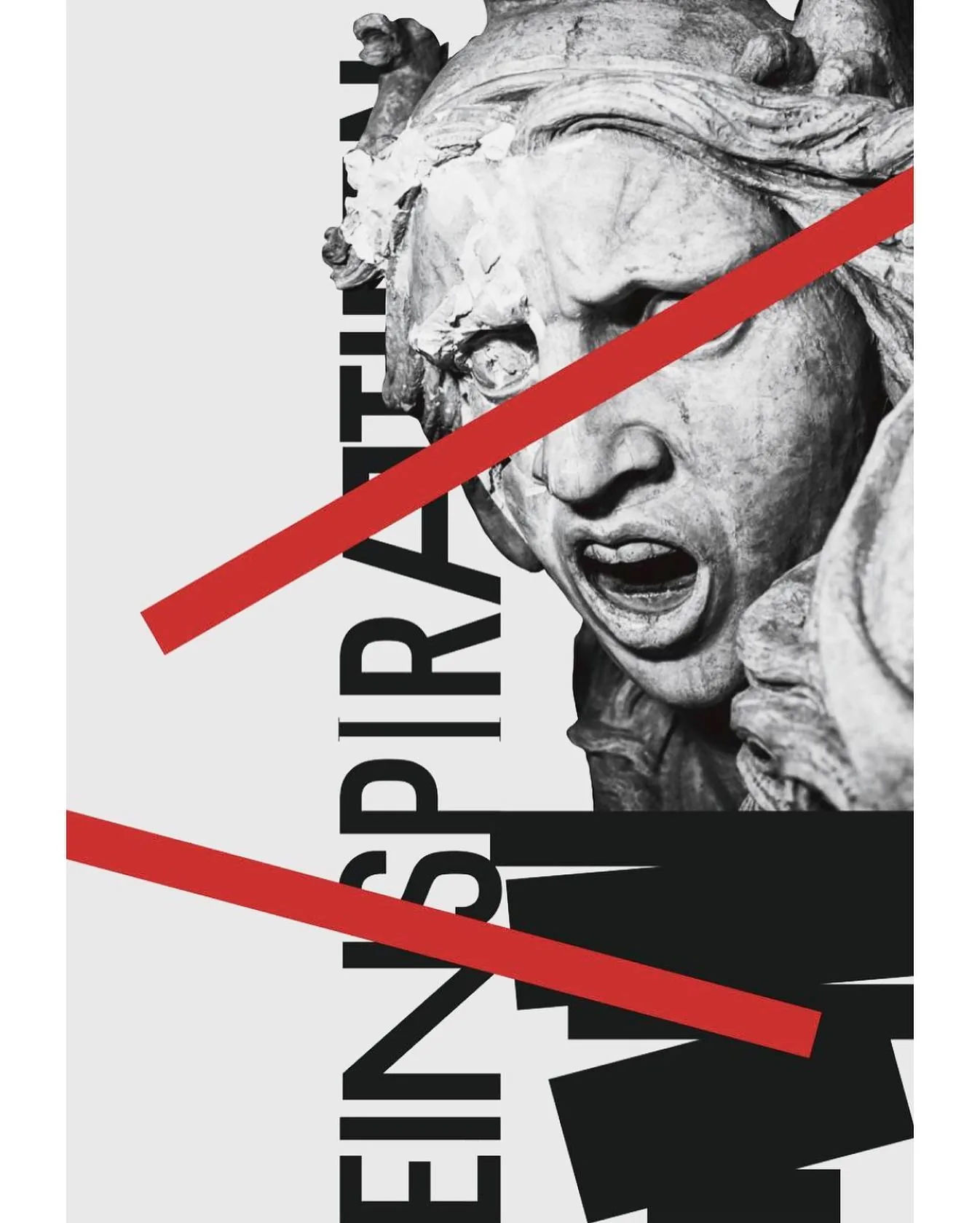
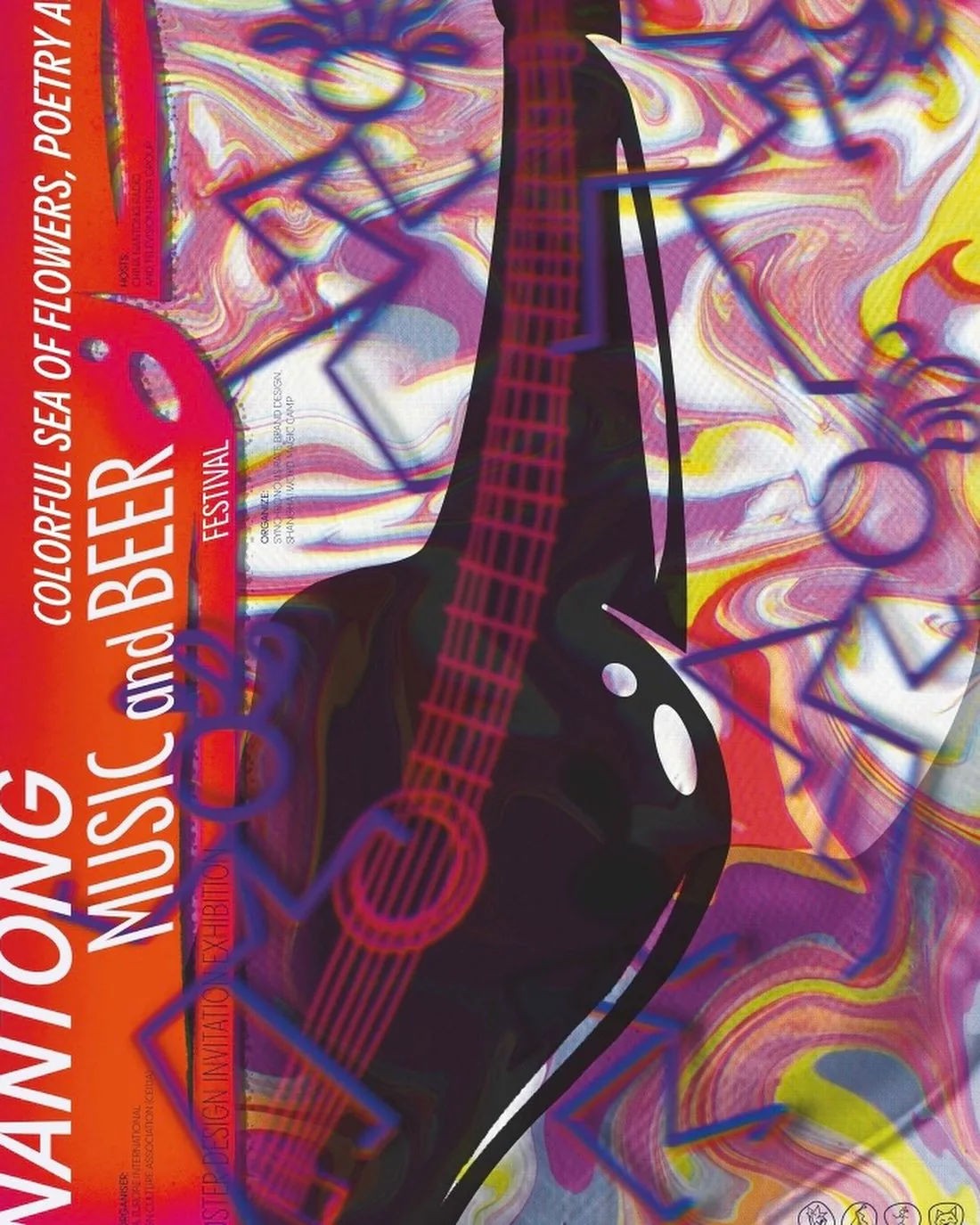
Anna Ganna has built a career on both sides of the poster: the side that makes them, and the side that decides, as a juror, what counts as good. She is a multidisciplinary artist and a researcher of contemporary visual culture, and a co-founder — of the Formula art group, and of this gallery — whose signature project, Poster Every Day, she built from nothing into an annual international exhibition; its 2026 edition brought together 74 posters from 60 participants across 21 countries, staged with partners GY2+NL, Brusnichny studio and Dprofile.
That range has put her on some of the field’s most closely watched panels: the Intercon Jury of the Poster Stellars Intercontinental Poster Competition, the jury of Bullseye’s “Traditional Turkish Archery” art exhibition, and, this year, a first-time seat on the jury of the 7th International Poster Biennial BIAH in Bolu, Turkey.
None of it has pulled her away from making work herself: bold, typographic pieces built from cultural fragments and everyday material, made under the same conviction that drives her curating, that a poster earns its place by saying something, not by looking finished. It is a rare vantage point, sitting on both sides of the table long enough to help build the table other people now sit at.
Why we like it: Ganna has spent her career deciding what counts as a good poster, and making them herself, which is exactly the kind of friend a gallery needs close at hand.
Find Anna online: Instagram



artist
Anna Ganna
Anna Ganna has built a career on both sides of the poster: the side that makes them, and the side that decides, as a juror, what counts as good. She is a multidisciplinary artist and a researcher of contemporary visual culture, and a co-founder — of the Formula art group, and of this gallery — whose signature project, Poster Every Day, she built from nothing into an annual international exhibition; its 2026 edition brought together 74 posters from 60 participants across 21 countries, staged with partners GY2+NL, Brusnichny studio and Dprofile.
That range has put her on some of the field’s most closely watched panels: the Intercon Jury of the Poster Stellars Intercontinental Poster Competition, the jury of Bullseye’s “Traditional Turkish Archery” art exhibition, and, this year, a first-time seat on the jury of the 7th International Poster Biennial BIAH in Bolu, Turkey.
None of it has pulled her away from making work herself: bold, typographic pieces built from cultural fragments and everyday material, made under the same conviction that drives her curating, that a poster earns its place by saying something, not by looking finished. It is a rare vantage point, sitting on both sides of the table long enough to help build the table other people now sit at.
Why we like it: Ganna has spent her career deciding what counts as a good poster, and making them herself, which is exactly the kind of friend a gallery needs close at hand.
Find Anna online: Instagram
Artist
Katia Bligh
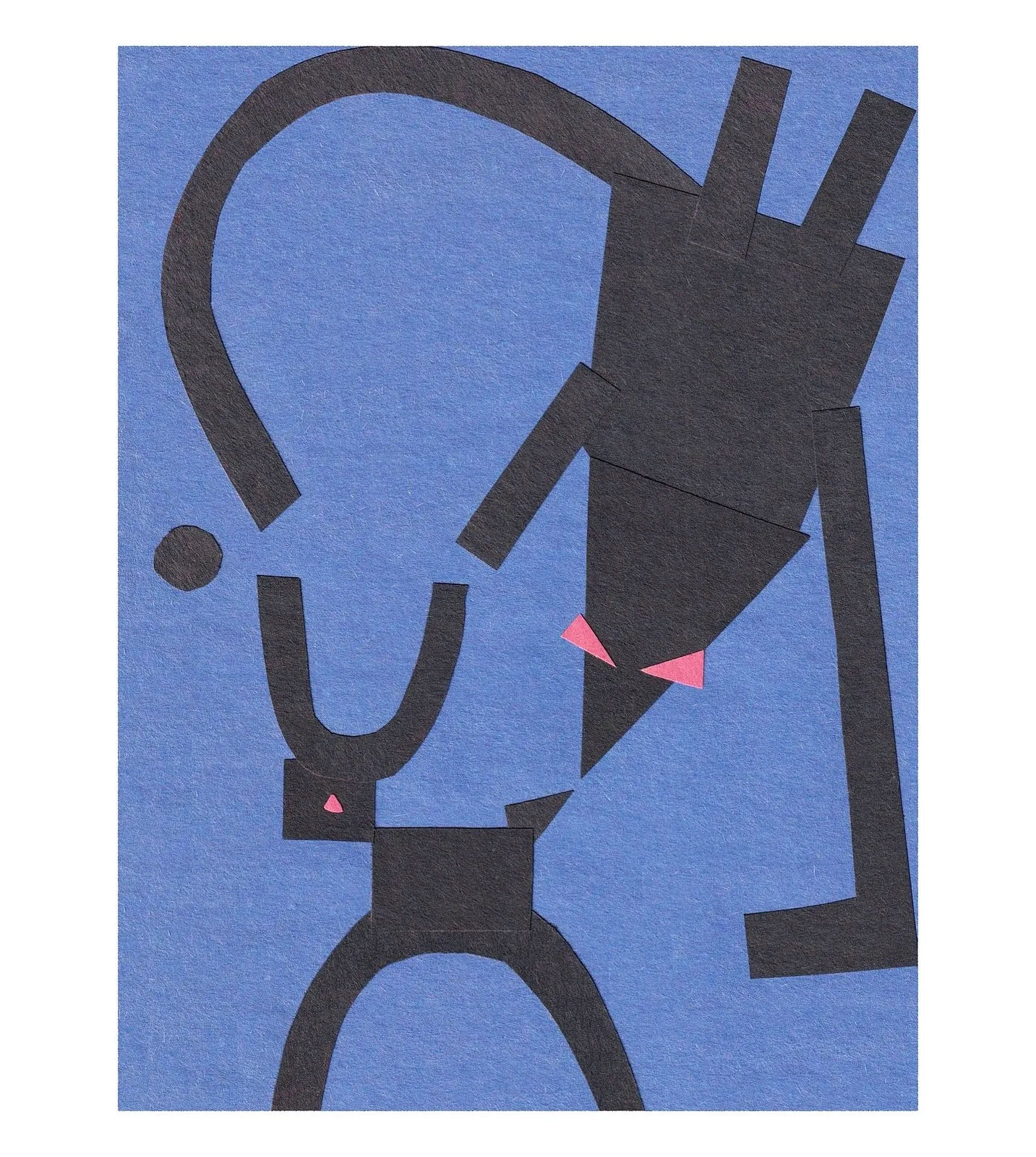
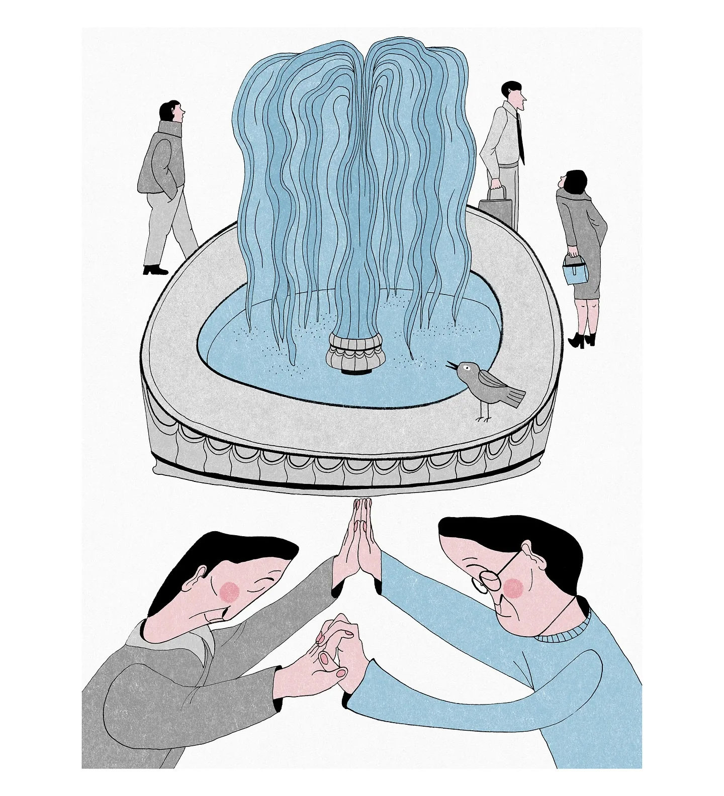
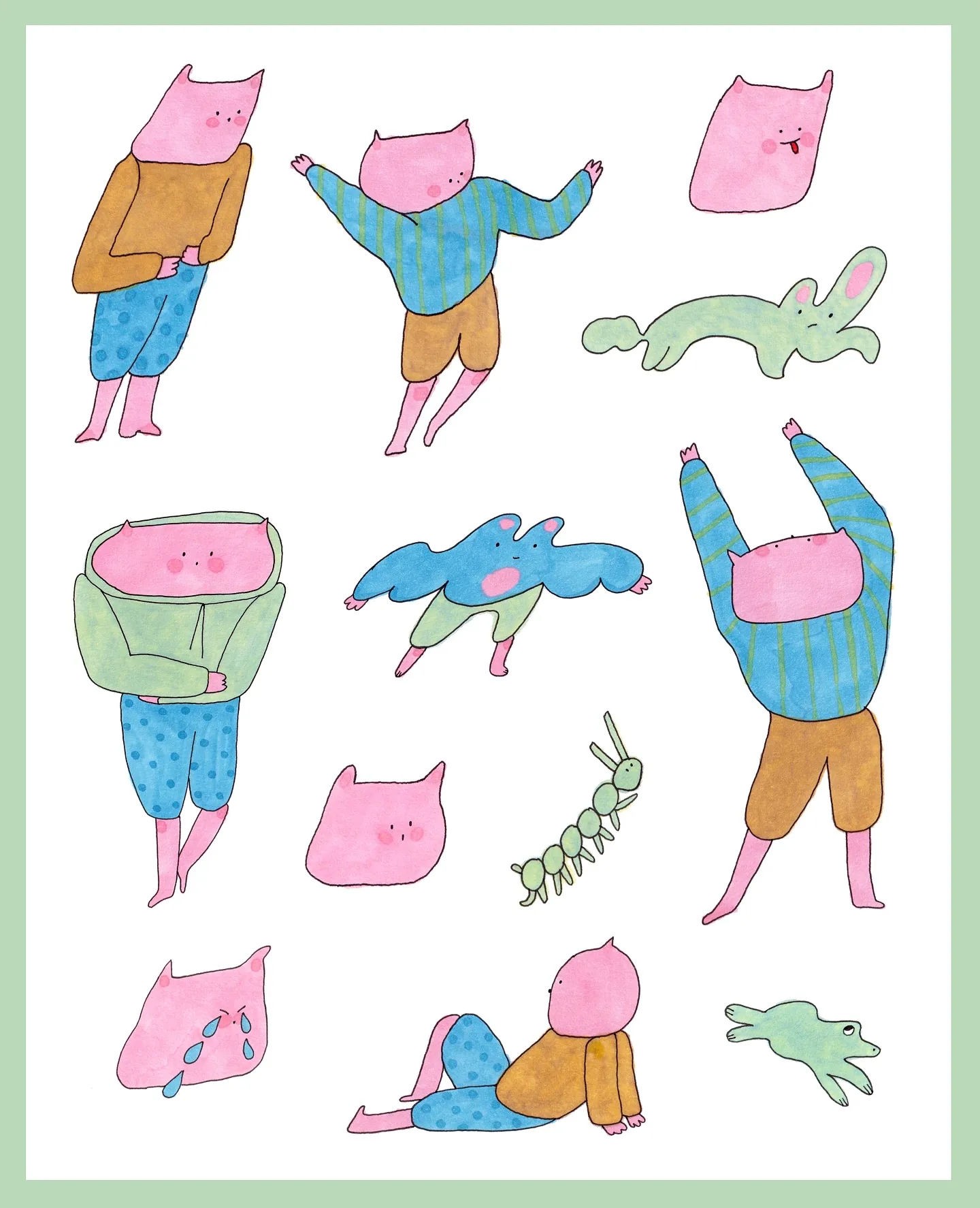
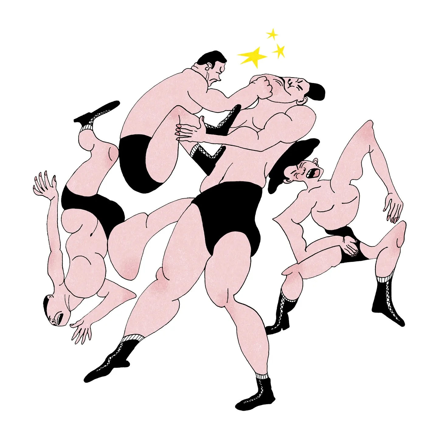
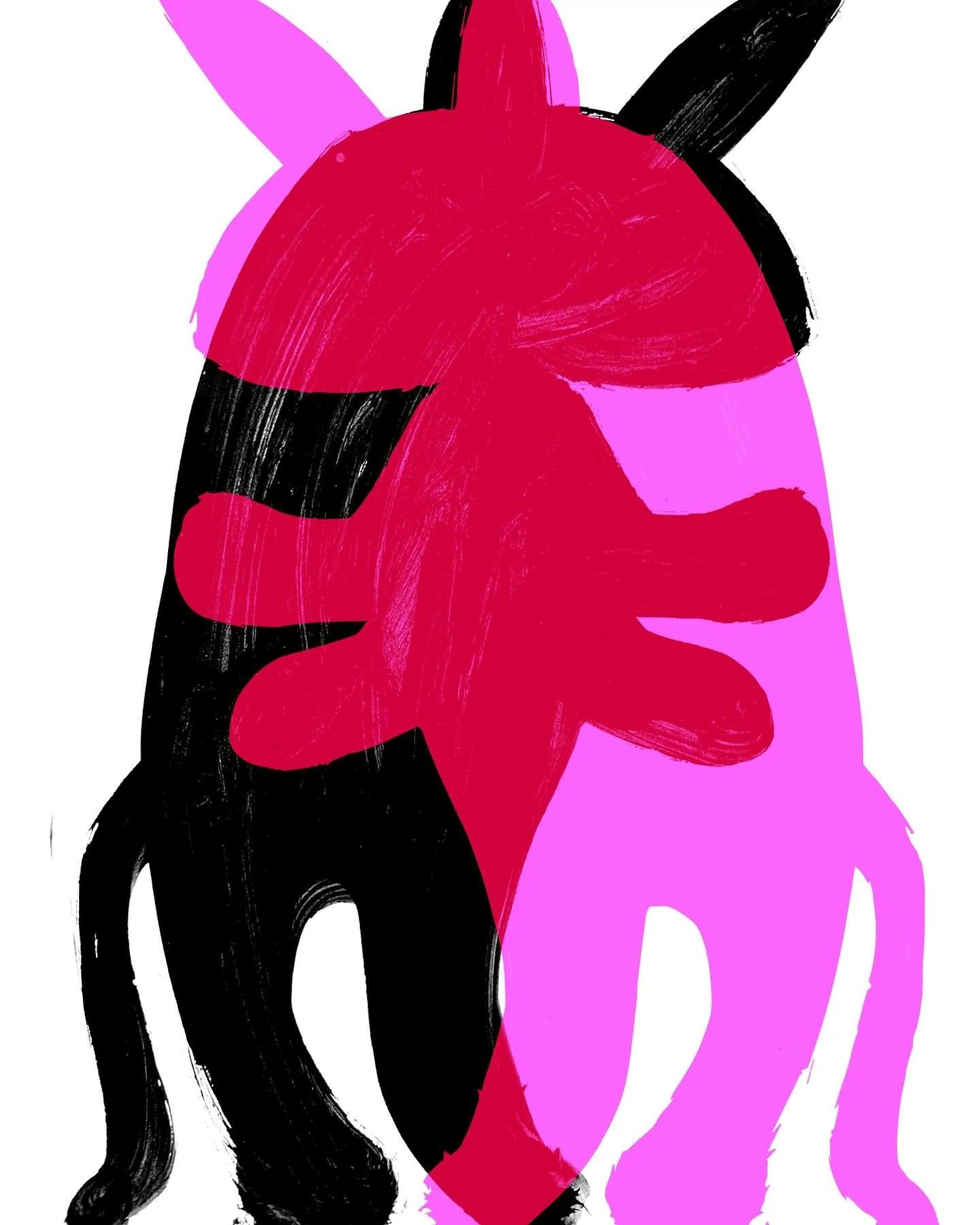
Katia Bligh’s animals bite back: patterned pink horses in harnesses drawn tight enough to matter, sticker-sheet casts of small creatures that all look like they are plotting something, portraits with just enough menace to be funny. She is entirely self-taught, working as an illustrator and book designer out of Pasadena, California, and her chosen territory, again and again, is quirky characters, friendships and love, built into dense, hand-drawn worlds.
Her two most decorated pieces were never assigned by anyone. A self-initiated cover redesign for “Alice’s Adventures in Wonderland” and “Through the Looking-Glass” won Category Winner in Book Covers on the New Talent track of the 2023 World Illustration Awards, run jointly by the UK’s Association of Illustrators and America’s Directory of Illustration; an imagined cold-brew tea packaging series took a Highly Commended the same year, in Design Product & Packaging. Both exist purely because she made them to sharpen a self-taught practice into a professional one.
Alice has been redesigned by illustrators for more than a century and a half. Bligh’s version, built on nothing but her own initiative, held its own in a New Talent field meant to spot exactly that kind of independent voice against professionally trained competition.
Why we like it: she treats an imagined tea label with the same care as a classic novel’s cover — proof that quirky characters, friendships and love is a design brief for her, not just a caption.


artist
Katia Bligh
Katia Bligh’s animals bite back: patterned pink horses in harnesses drawn tight enough to matter, sticker-sheet casts of small creatures that all look like they are plotting something, portraits with just enough menace to be funny. She is entirely self-taught, working as an illustrator and book designer out of Pasadena, California, and her chosen territory, again and again, is quirky characters, friendships and love, built into dense, hand-drawn worlds.
Her two most decorated pieces were never assigned by anyone. A self-initiated cover redesign for “Alice’s Adventures in Wonderland” and “Through the Looking-Glass” won Category Winner in Book Covers on the New Talent track of the 2023 World Illustration Awards, run jointly by the UK’s Association of Illustrators and America’s Directory of Illustration; an imagined cold-brew tea packaging series took a Highly Commended the same year, in Design Product & Packaging. Both exist purely because she made them to sharpen a self-taught practice into a professional one.
Alice has been redesigned by illustrators for more than a century and a half. Bligh’s version, built on nothing but her own initiative, held its own in a New Talent field meant to spot exactly that kind of independent voice against professionally trained competition.
Why we like it: she treats an imagined tea label with the same care as a classic novel’s cover — proof that quirky characters, friendships and love is a design brief for her, not just a caption.
Artist
Lena Slepushkina
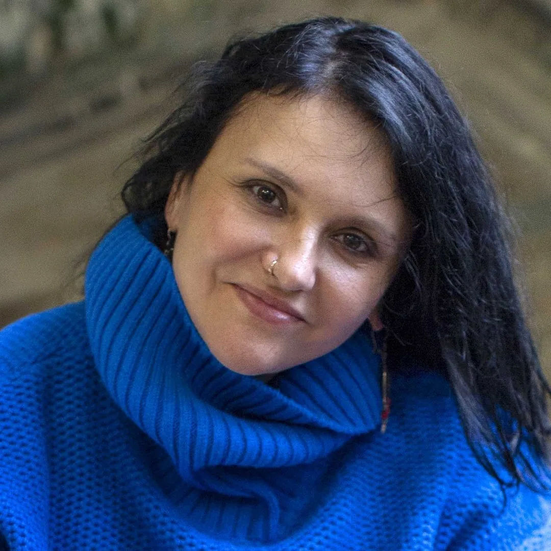
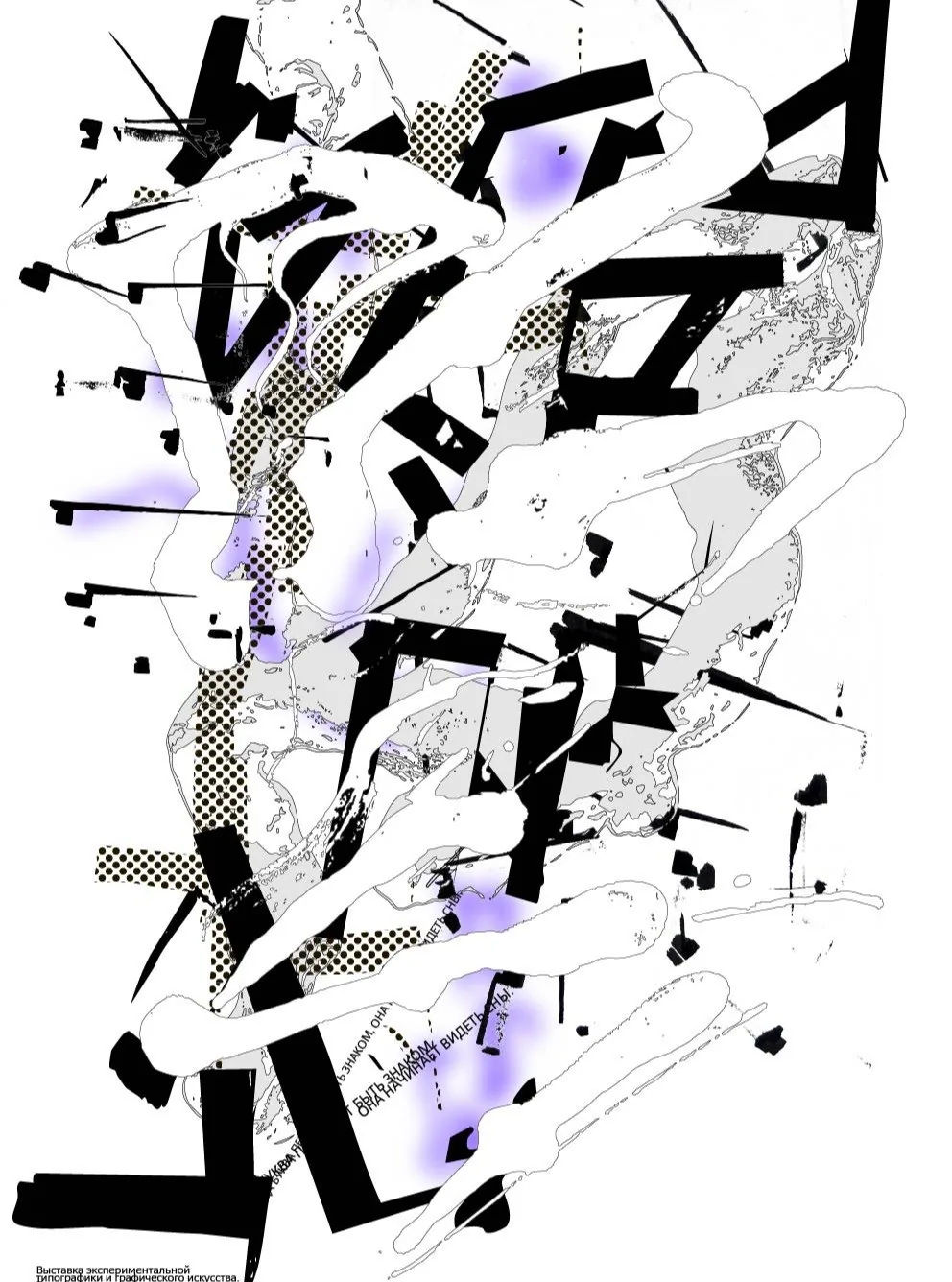
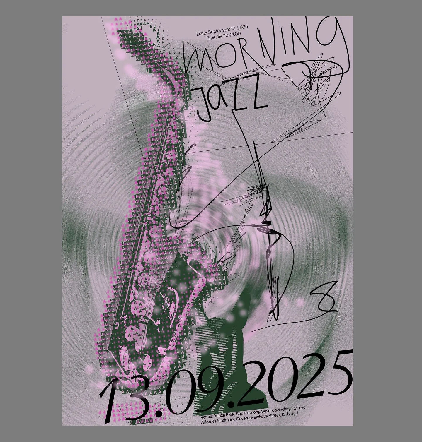
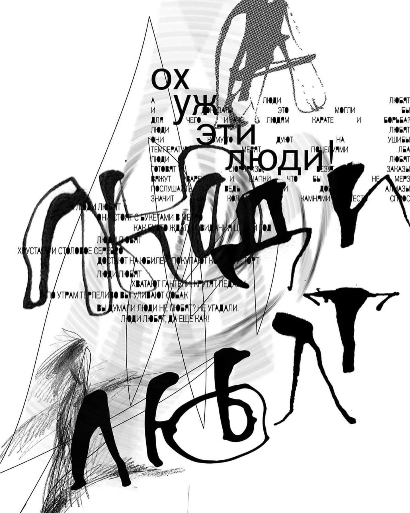
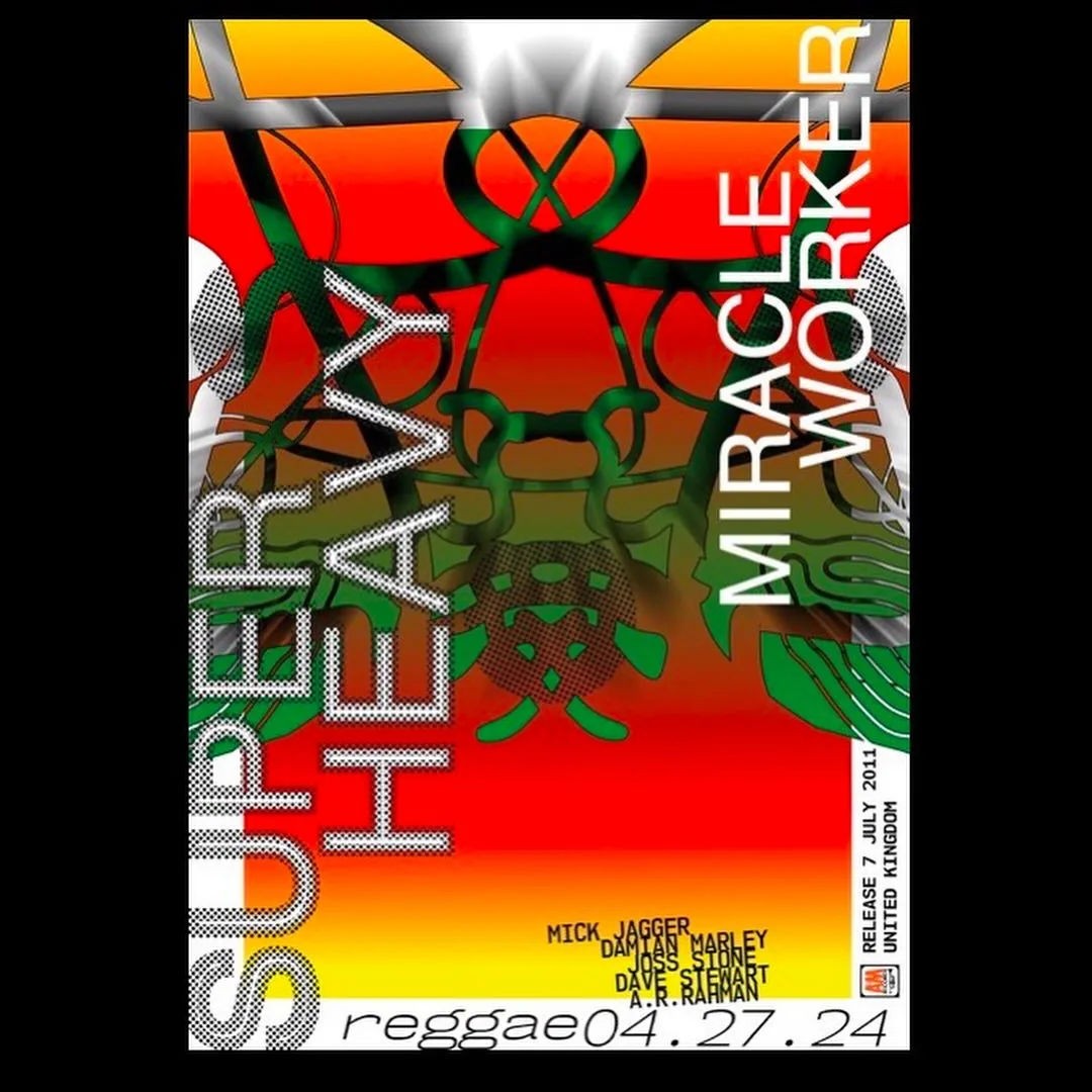
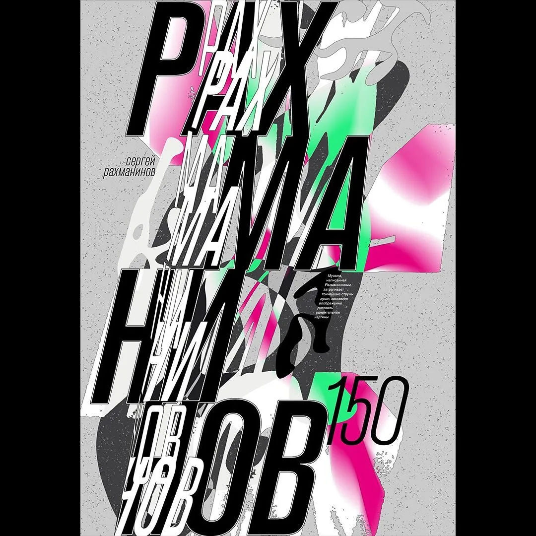
Lena Slepushkina’s letters look like they are still wet. Her cohort-25 poster at the Bankov Poster School, made for an imagined concert that promised to “step into a world of dreams and music”, was already built from dense, expressive brush lettering layered over halftone texture and digital noise — drawn as much as designed.
That same hand gets put to real bookings. Her poster for Morning Jazz, a live open-air saxophone session, ran through the same rough-edged calligraphy, a design as unpolished and alive as the event it announced. Between school studies and real commissions, she keeps circling the same territory: hand lettering pushed to the edge of legibility, softened by scanner grain and pattern.
It is a fitting pairing of instincts. Jazz favours the note played slightly off the beat, and her lettering favours the line that refuses to sit still, smudged and looping rather than set.
Why we like it: Slepushkina draws her type instead of setting it, and it shows — her posters look handled, like something that could still smudge if you touched them.
Find Lena online: Instagram
artist
Lena Slepushkina
Lena Slepushkina’s letters look like they are still wet. Her cohort-25 poster at the Bankov Poster School, made for an imagined concert that promised to “step into a world of dreams and music”, was already built from dense, expressive brush lettering layered over halftone texture and digital noise — drawn as much as designed.
That same hand gets put to real bookings. Her poster for Morning Jazz, a live open-air saxophone session, ran through the same rough-edged calligraphy, a design as unpolished and alive as the event it announced. Between school studies and real commissions, she keeps circling the same territory: hand lettering pushed to the edge of legibility, softened by scanner grain and pattern.
It is a fitting pairing of instincts. Jazz favours the note played slightly off the beat, and her lettering favours the line that refuses to sit still, smudged and looping rather than set.
Why we like it: Slepushkina draws her type instead of setting it, and it shows — her posters look handled, like something that could still smudge if you touched them.
Find Lena online: Instagram
Artist
Nadia Diuu

Nadia Diuu is a graphic designer and visual artist based in Berlin. She has called Germany home for the past decade, and she has been doing graphic design for more than twenty years now.
Her work sits at the intersection of visual communication, typography, and social engagement. She works with human rights organizations and is an active supporter of the LGBTQ+ community, along with causes around equality, inclusion, and basic human rights.
Since late 2023, her art has been focused on anti-war themes — using type and visual language to dig into ideas like freedom, personal choice, responsibility, and human dignity. For her, design isn’t just about how something looks; it’s a way to make people stop, think, start conversations, and give weight to ideas that actually matter.
Her work has been shown internationally, in Canada, the Netherlands, Germany, Portugal, and Spain.
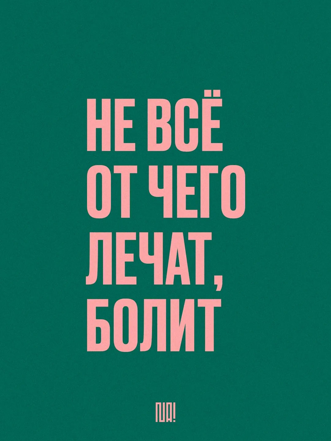
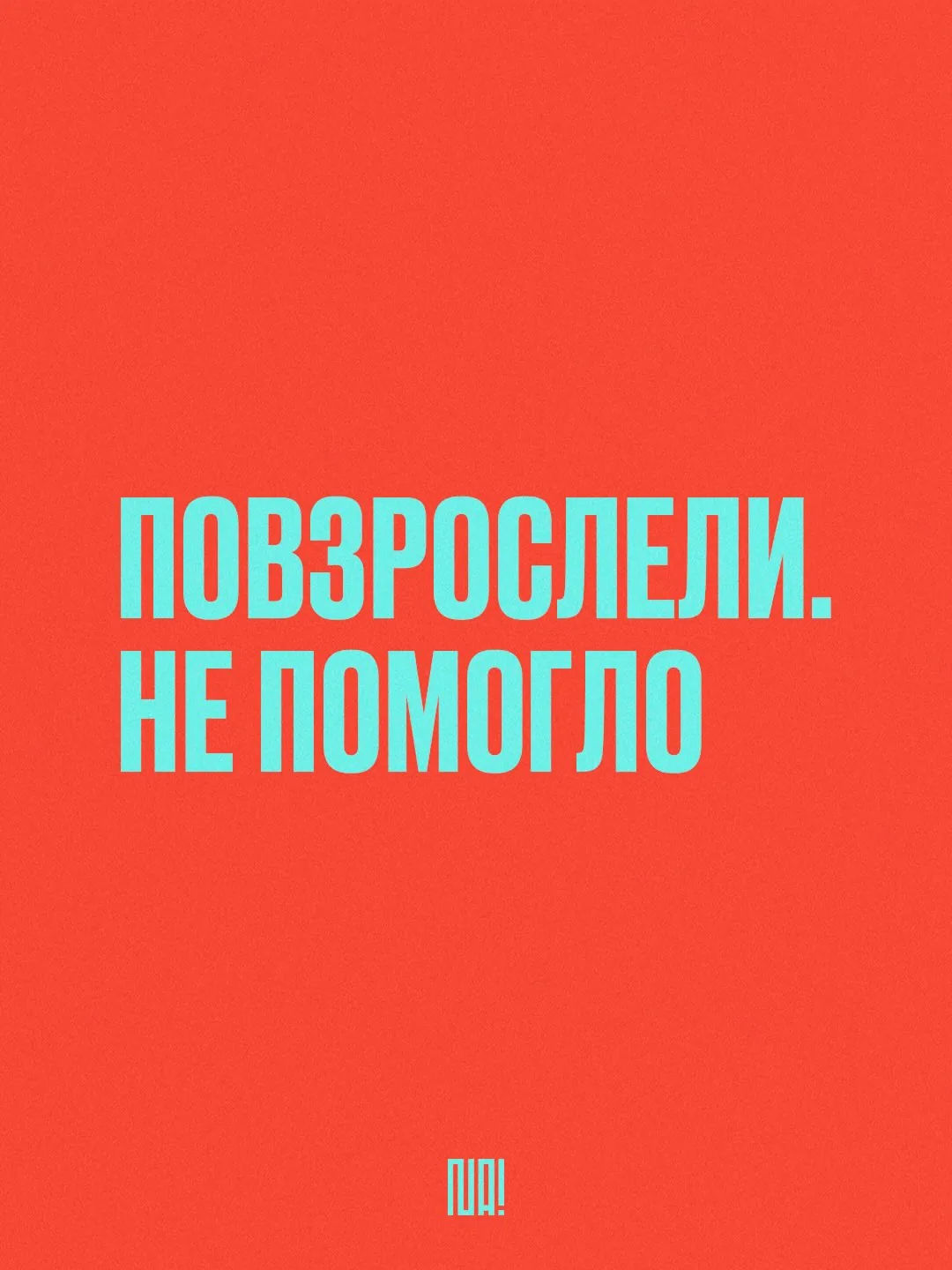
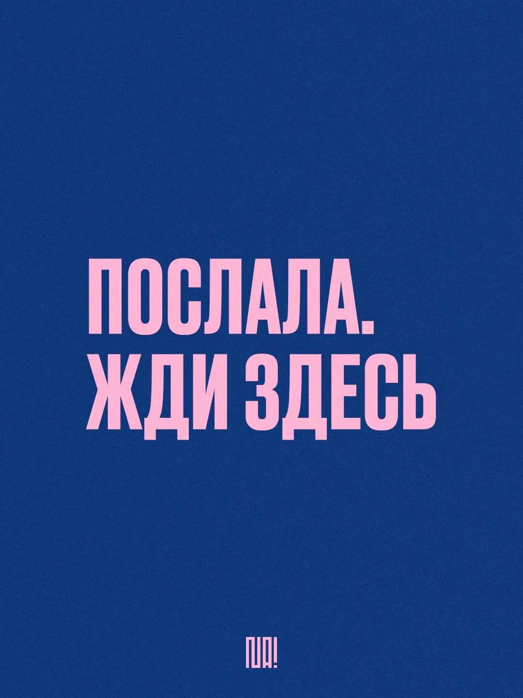
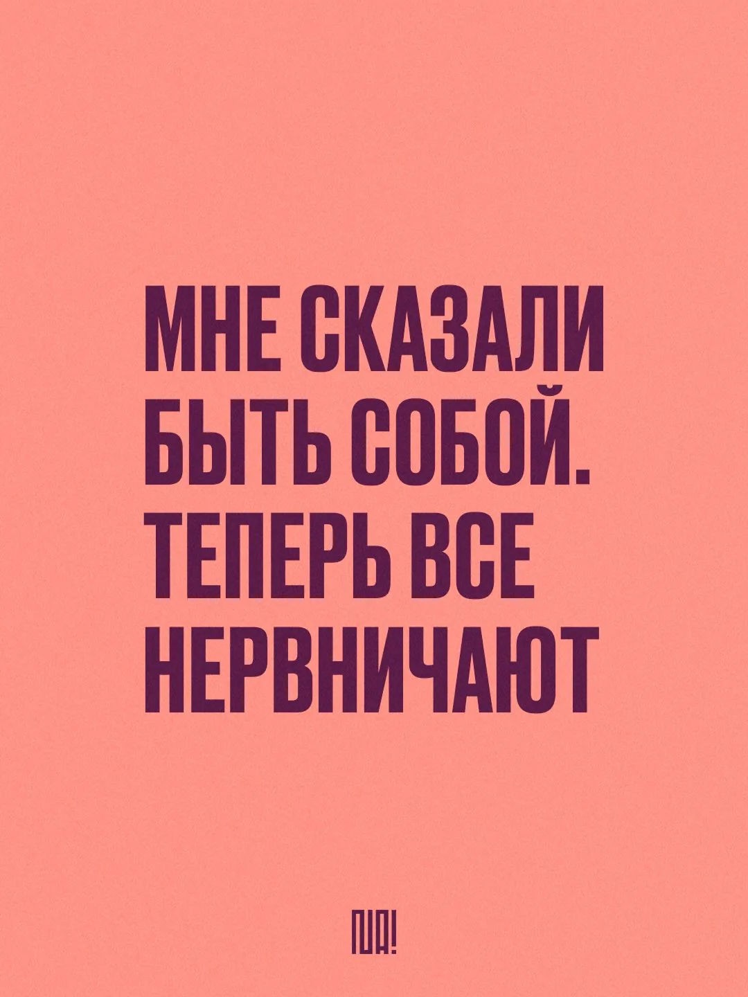
She really only has one move — a flat block of color and one oversized headline — and she leans into it completely. Her poster series are made to be screenshotted as much as they’re made to be looked at: each one boils a whole worldview down to a single blunt line, with a directness that feels part protest-graphic, part meme — built for a feed, not a gallery wall. And it works — she’s built an audience in the tens of thousands.
It all comes down to the same underlying belief: that one well-sized sentence can do more than a whole paragraph ever could — whether it’s naming a feeling nobody’s quite put into words before, or just landing a truth people already sensed but hadn’t heard said out loud.
Find Nadia online: Instagram


artist
Nadia Diuu
Nadia Diuu is a graphic designer and visual artist based in Berlin. She has called Germany home for the past decade, and she has been doing graphic design for more than twenty years now.
Her work sits at the intersection of visual communication, typography, and social engagement. She works with human rights organizations and is an active supporter of the LGBTQ+ community, along with causes around equality, inclusion, and basic human rights.
Since late 2023, her art has been focused on anti-war themes — using type and visual language to dig into ideas like freedom, personal choice, responsibility, and human dignity. For her, design isn’t just about how something looks; it’s a way to make people stop, think, start conversations, and give weight to ideas that actually matter.
Her work has been shown internationally, in Canada, the Netherlands, Germany, Portugal, and Spain.
She really only has one move — a flat block of color and one oversized headline — and she leans into it completely. Her poster series are made to be screenshotted as much as they’re made to be looked at: each one boils a whole worldview down to a single blunt line, with a directness that feels part protest-graphic, part meme — built for a feed, not a gallery wall. And it works — she’s built an audience in the tens of thousands.
It all comes down to the same underlying belief: that one well-sized sentence can do more than a whole paragraph ever could — whether it’s naming a feeling nobody’s quite put into words before, or just landing a truth people already sensed but hadn’t heard said out loud.
Find Nadia online: Instagram
Artist
Tanya Kuznetsova

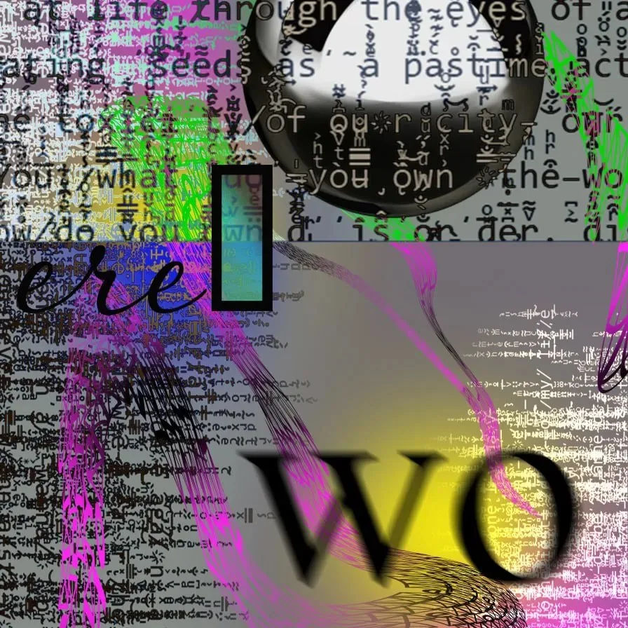
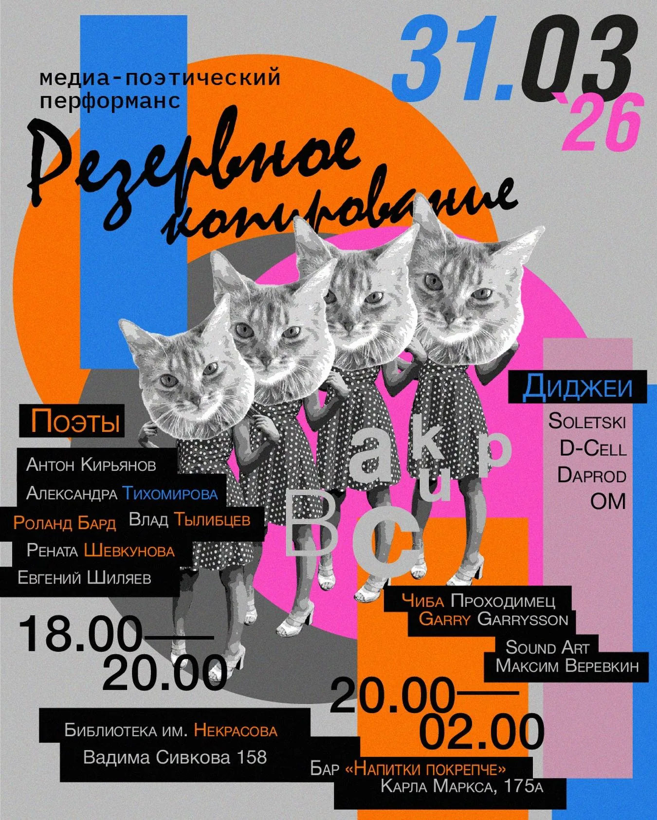
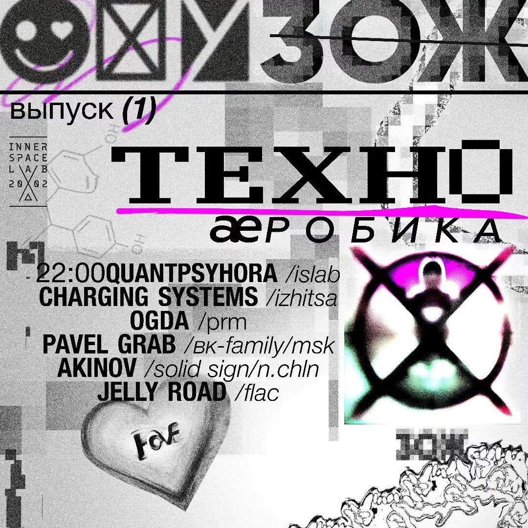
Tanya Kuznetsova, fed daily by the Poster Every Day discipline, she designs for club nights, literary-performance evenings and bicycle-day campaigns, and pushes standalone typographic studies until her Cyrillic lettering looks glitched and unstable, on the verge of falling apart, a deliberate rebellion against the tidy line she draws all week for children. Her poster for a media-poetry performance, built from a chorus of repeated cat portraits packed against dense event information, shows the same instinct for structure that holds her book layouts together: proof that discipline and chaos can share one hand.
Poster Every Day regulars know her work by its restraint: no wasted mark, no cheap effect not earned by the concept underneath it. Showing up with a finished poster daily, for years, is its own kind of achievement in a field where most people quit after a month — and it is exactly the habit that makes her two practices, the tender and the glitched, feel like one hand rather than two people sharing a desk.
Why we like it: Kuznetsova’s posters have the exacting hand of someone who draws for children’s books all day, nothing there by accident, and everything drawn, never just typed.
Find Tanya online: Instagram · Behance



artist
Tanya Kuznetsova
Tanya Kuznetsova, fed daily by the Poster Every Day discipline, she designs for club nights, literary-performance evenings and bicycle-day campaigns, and pushes standalone typographic studies until her Cyrillic lettering looks glitched and unstable, on the verge of falling apart, a deliberate rebellion against the tidy line she draws all week for children. Her poster for a media-poetry performance, built from a chorus of repeated cat portraits packed against dense event information, shows the same instinct for structure that holds her book layouts together: proof that discipline and chaos can share one hand.
Poster Every Day regulars know her work by its restraint: no wasted mark, no cheap effect not earned by the concept underneath it. Showing up with a finished poster daily, for years, is its own kind of achievement in a field where most people quit after a month — and it is exactly the habit that makes her two practices, the tender and the glitched, feel like one hand rather than two people sharing a desk.
Why we like it: Kuznetsova’s posters have the exacting hand of someone who draws for children’s books all day, nothing there by accident, and everything drawn, never just typed.
Find Tanya online: Instagram · Behance
Artist
Alena Linnask
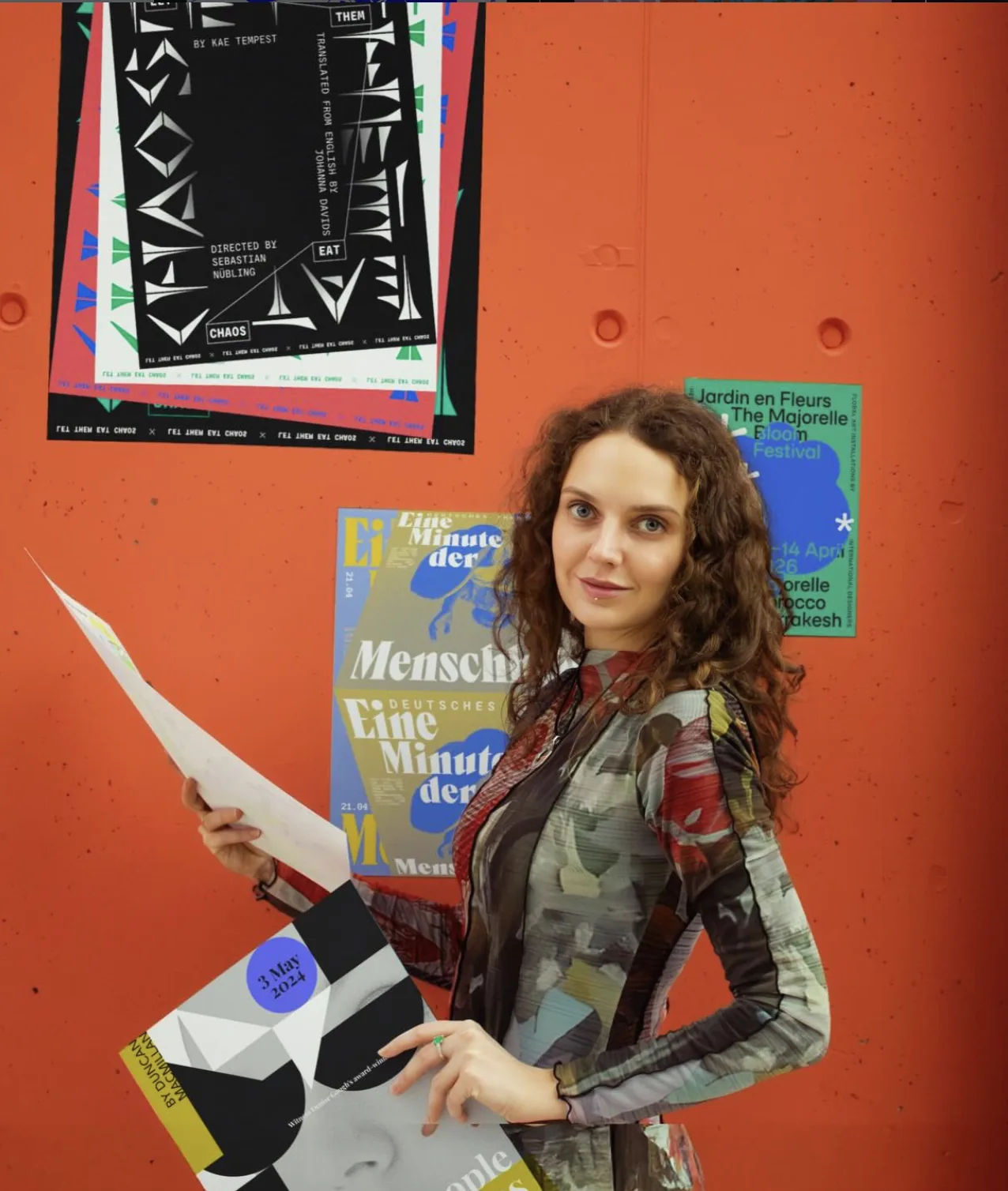
Alena Linnask is a Dessau-based graphic designer whose practice centres on typography, poster design, and visual identity. With over eight years of experience, she creates type-driven visual communication for international type foundries, cultural institutions, and exhibitions. Her work is particularly recognised for typographic specimens: she has designed more than 200 specimens for typefaces released by over 20 international foundries. As a long-term collaborator of Schrifteria Foundry, her work has been presented at Typographics New York 2026 and the Type Directors Club 2026, while the type families by Schrifteria Foundry for which she created visual campaigns have received honours from the European Design Awards, Communication Design Awards, and the ADC Annual Awards.
Alongside commissioned work, poster design forms an independent part of her artistic practice. Her posters have been selected for major international exhibitions and biennials, including the International Poster Biennale Warsaw, Golden Bee Global Biennale, Graphic Design Biennial Budapest, BIPB International Poster Biennale, and the International Poster Biennale Lublin. Her work has also received multiple awards from the Graphis Poster Annual and the Poster Quadrennial Bardejov. Alena’s typographic specimens and experimental works have been published in Slanted Magazine — Experimental Type 4.0, Serif In Use — A Collection of Serif Typefaces by Victionary, and Fine Specimens by Elliot Jay Stocks.
A student of Peter Bankov, Linnask has also participated in workshops led by renowned designers including Erich Brechbühl, Marina Willer, Dóra Balla, Sergey Serov, and others.
Her approach combines typography and experimentation with structured visual systems, exploring how letterforms shape narrative, rhythm, and visual perception.


artist
Alena Linnask
Alena Linnask is a Dessau-based graphic designer whose practice centres on typography, poster design, and visual identity. With over eight years of experience, she creates type-driven visual communication for international type foundries, cultural institutions, and exhibitions. Her work is particularly recognised for typographic specimens: she has designed more than 200 specimens for typefaces released by over 20 international foundries. As a long-term collaborator of Schrifteria Foundry, her work has been presented at Typographics New York 2026 and the Type Directors Club 2026, while the type families by Schrifteria Foundry for which she created visual campaigns have received honours from the European Design Awards, Communication Design Awards, and the ADC Annual Awards.
Alongside commissioned work, poster design forms an independent part of her artistic practice. Her posters have been selected for major international exhibitions and biennials, including the International Poster Biennale Warsaw, Golden Bee Global Biennale, Graphic Design Biennial Budapest, BIPB International Poster Biennale, and the International Poster Biennale Lublin. Her work has also received multiple awards from the Graphis Poster Annual and the Poster Quadrennial Bardejov. Alena’s typographic specimens and experimental works have been published in Slanted Magazine — Experimental Type 4.0, Serif In Use — A Collection of Serif Typefaces by Victionary, and Fine Specimens by Elliot Jay Stocks.
A student of Peter Bankov, Linnask has also participated in workshops led by renowned designers including Erich Brechbühl, Marina Willer, Dóra Balla, Sergey Serov, and others.
Her approach combines typography and experimentation with structured visual systems, exploring how letterforms shape narrative, rhythm, and visual perception.
Artist
Victor Tyapkov

Victor Tyapkov spends his working days doing two things that shouldn’t share a desk: drawing maps precise enough for a history museum, and making posters loose enough to swing. His long-running series for Jazz Days, an international jazz festival, has quietly become part of the festival’s own identity — type that swings, colour that behaves like a rhythm section — and a companion series for a regional blues festival works the same instinct in a rawer key.
The map-making is serious work: exhibition graphics and maps for the GULAG History Museum are his most-viewed project on Behance, alongside identities for the Arctic Open film festival, a history of the Novaya Zemlya archipelago, and a book about a felt-boot factory. In 2019 he founded Plakat-Tsentr, an informal association built on a simple bet: designers who actually know each other make a stronger scene than designers who only follow each other online. Through it he runs “Igra v plakat” (“Poster Game”), a workshop aimed squarely at getting participants onto international shortlists, hosts “Design-Wednesday” meetups, and organises joint labs with the Typomania festival and the Golden Bee biennale.
It is a small piece of infrastructure with an outsized effect: a regional poster scene now has a shared room to stand in, and its designers are turning up on shortlists that used to belong to somebody else. Tyapkov’s own work travels on that same instinct for connection, shown at the international RED ZONE poster campaign alongside designers from Italy, Venezuela, Indonesia, Egypt, Mexico and Peru, and selected into Behance’s own curated Exhibition & Signage and InDesign galleries. He talked all of it through, visual culture, local codes, building a design community from nothing, on the Severny Ogonyok podcast.
Why we like it: he is precise the way a cartographer is precise, and somehow the letters still get to dance.


artist
Victor Tyapkov
Victor Tyapkov spends his working days doing two things that shouldn’t share a desk: drawing maps precise enough for a history museum, and making posters loose enough to swing. His long-running series for Jazz Days, an international jazz festival, has quietly become part of the festival’s own identity — type that swings, colour that behaves like a rhythm section — and a companion series for a regional blues festival works the same instinct in a rawer key.
The map-making is serious work: exhibition graphics and maps for the GULAG History Museum are his most-viewed project on Behance, alongside identities for the Arctic Open film festival, a history of the Novaya Zemlya archipelago, and a book about a felt-boot factory. In 2019 he founded Plakat-Tsentr, an informal association built on a simple bet: designers who actually know each other make a stronger scene than designers who only follow each other online. Through it he runs “Igra v plakat” (“Poster Game”), a workshop aimed squarely at getting participants onto international shortlists, hosts “Design-Wednesday” meetups, and organises joint labs with the Typomania festival and the Golden Bee biennale.
It is a small piece of infrastructure with an outsized effect: a regional poster scene now has a shared room to stand in, and its designers are turning up on shortlists that used to belong to somebody else. Tyapkov’s own work travels on that same instinct for connection, shown at the international RED ZONE poster campaign alongside designers from Italy, Venezuela, Indonesia, Egypt, Mexico and Peru, and selected into Behance’s own curated Exhibition & Signage and InDesign galleries. He talked all of it through, visual culture, local codes, building a design community from nothing, on the Severny Ogonyok podcast.
Why we like it: he is precise the way a cartographer is precise, and somehow the letters still get to dance.
Artist
Alisa Frolova

By day, Alisa Frolova renders motion graphics precise enough to survive a six-second ad; by night she blows the same discipline up to poster size and lets it misbehave. Nine-plus years across brand identity, marketing design, motion and 3D have taken her from event branding and in-store displays for DLT Department Store, through building out red_mad_robot's branding system and bringing AI-assisted processes into its visual pipeline, to her current post as Lead Marketing Designer at Career.io, the company behind Resume.io, now working from Lisbon.
Her poster practice runs rendered 3D forms against typography that refuses to sit still, sculpture built like layout, or the other way round. It is part of a wider shift in the medium, as designers trained in interfaces and motion bring studio-grade CGI into a form that used to live and die by print, and Frolova submits the results to international contests rather than keeping them as side projects.
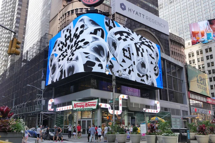
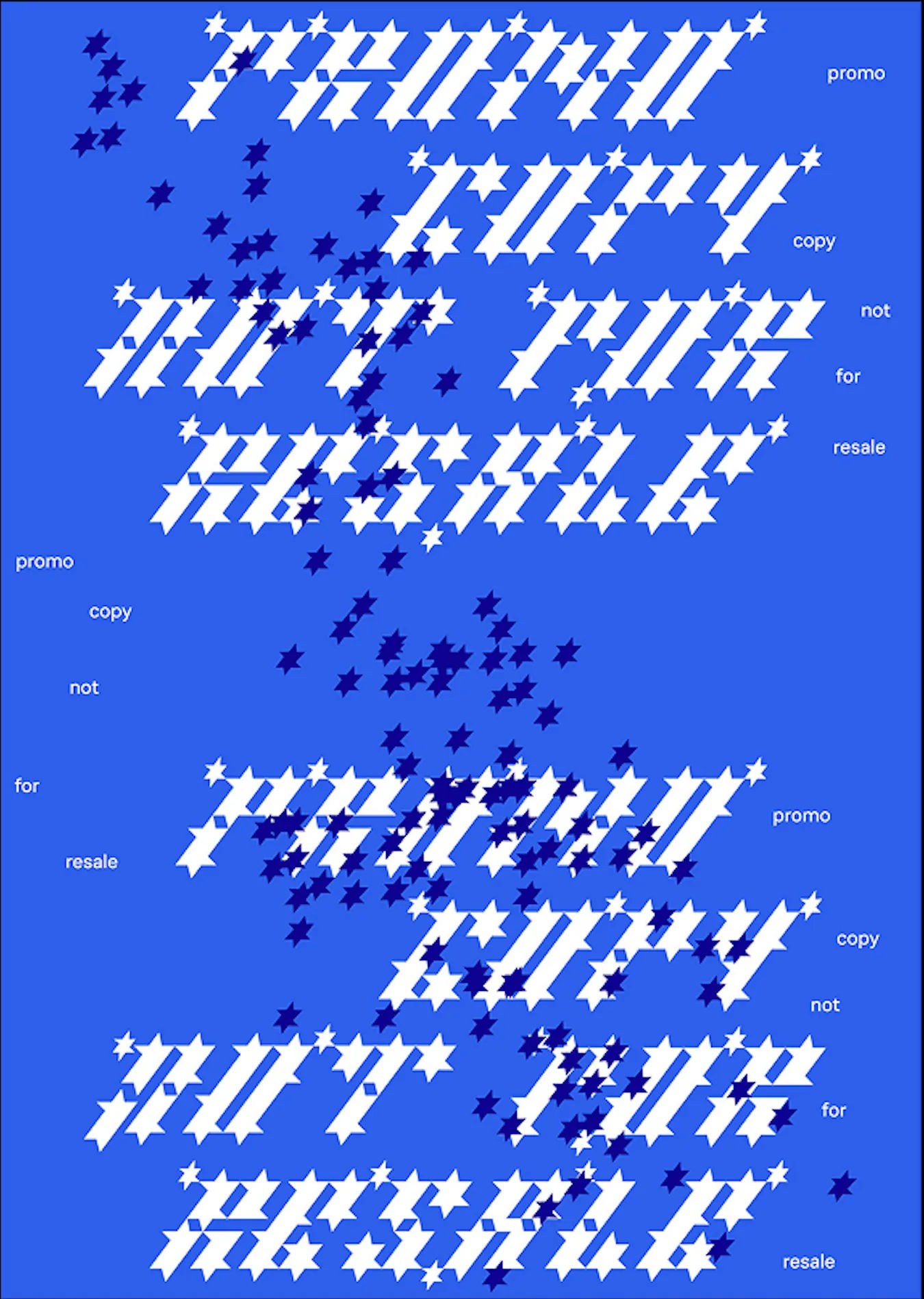
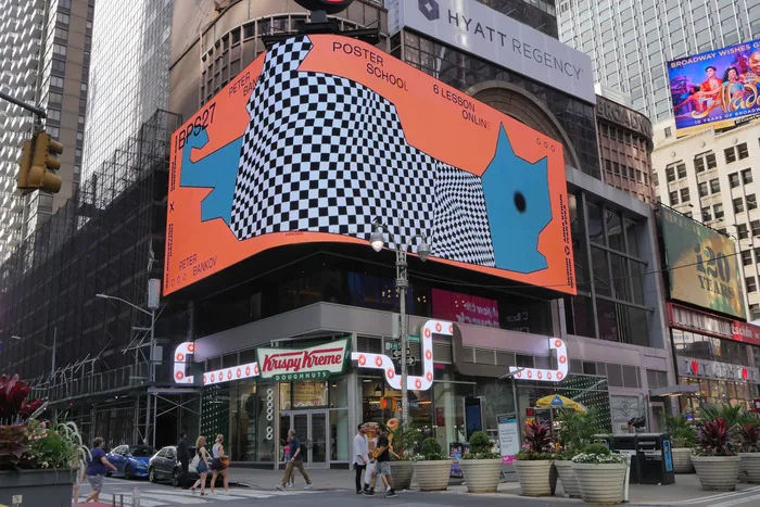
An alumna of the Bankov Poster School, she made “Bloom” for its fifth-anniversary anthology of twelve motion posters, “no clients, no briefs, no limits,” which ran on Times Square's digital billboards in June 2025 as part of Art Innovation Gallery's “Twice Seen” exhibition — covered by PRINT Magazine's Daily Heller column, People of Print and Fonts In Use, and later a Communication Arts Award of Excellence. She has also picked up recognition at the Luga Poster Biennale and been featured at Forward Festival.
Why we like it: Bloom is what happens when a product designer stops asking for a brief.

artist
Alisa Frolova
By day, Alisa Frolova renders motion graphics precise enough to survive a six-second ad; by night she blows the same discipline up to poster size and lets it misbehave. Nine-plus years across brand identity, marketing design, motion and 3D have taken her from event branding and in-store displays for DLT Department Store, through building out red_mad_robot's branding system and bringing AI-assisted processes into its visual pipeline, to her current post as Lead Marketing Designer at Career.io, the company behind Resume.io, now working from Lisbon.
Her poster practice runs rendered 3D forms against typography that refuses to sit still, sculpture built like layout, or the other way round. It is part of a wider shift in the medium, as designers trained in interfaces and motion bring studio-grade CGI into a form that used to live and die by print, and Frolova submits the results to international contests rather than keeping them as side projects.
An alumna of the Bankov Poster School, she made “Bloom” for its fifth-anniversary anthology of twelve motion posters, “no clients, no briefs, no limits,” which ran on Times Square's digital billboards in June 2025 as part of Art Innovation Gallery's “Twice Seen” exhibition — covered by PRINT Magazine's Daily Heller column, People of Print and Fonts In Use, and later a Communication Arts Award of Excellence. She has also picked up recognition at the Luga Poster Biennale and been featured at Forward Festival.
Why we like it: Bloom is what happens when a product designer stops asking for a brief.
Artist
Anastasia Nechiporenko
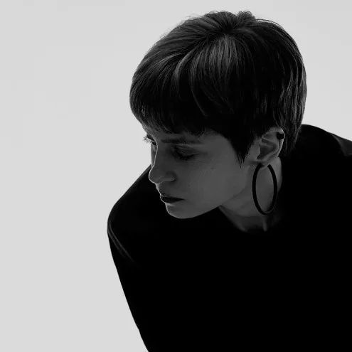
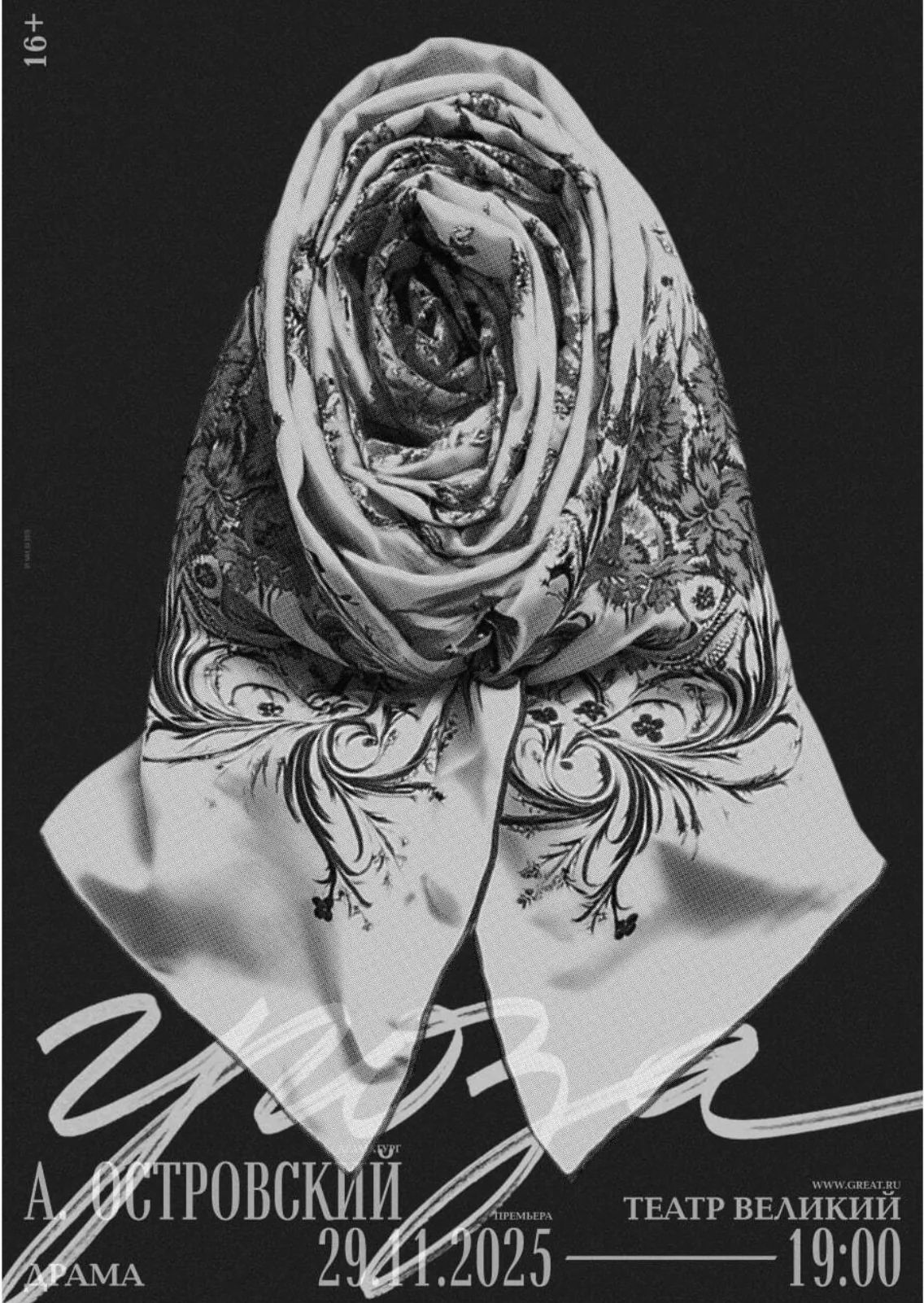
Anastasia Nechiporenko is a communication designer first: identities, print and editorial systems for brands and subjects that already know exactly who they are, with web design arriving later and in smaller doses. Her Behance is where that range is easiest to read — concept work for Katami Wear and Southern Cold, a redesign concept for Vogue UK and for the Cecil Beaton archive, a redesign of “Felix Beato. Journey to the East” and the book project “Lyfjaberg” — more than 67,000 project views and 6,100 appreciations since 2019, with Katami Wear alone drawing over 35,000 of them.
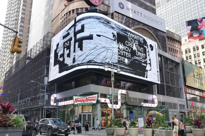
That same instinct for systems shows up in her poster work too, except here the clean structure suddenly breaks into something personal. “Creative DNA,” made for the Bankov Poster School's fifth-anniversary anthology on Times Square in June 2025 and animated with motion designer Vyacheslav Vaganov in CoFo Sans VF, is a poster about what makes a designer a designer: the part you cannot outsource to a template. The anthology went on to a Communication Arts Award of Excellence, after coverage from PRINT Magazine's Daily Heller column, People of Print and Fonts In Use.
Why we like it: it treats identity the way a lab treats a sample, with curiosity, not vanity.



artist
Anastasia Nechiporenko
Anastasia Nechiporenko is a communication designer first: identities, print and editorial systems for brands and subjects that already know exactly who they are, with web design arriving later and in smaller doses. Her Behance is where that range is easiest to read — concept work for Katami Wear and Southern Cold, a redesign concept for Vogue UK and for the Cecil Beaton archive, a redesign of “Felix Beato. Journey to the East” and the book project “Lyfjaberg” — more than 67,000 project views and 6,100 appreciations since 2019, with Katami Wear alone drawing over 35,000 of them.
That same instinct for systems shows up in her poster work too, except here the clean structure suddenly breaks into something personal. “Creative DNA,” made for the Bankov Poster School's fifth-anniversary anthology on Times Square in June 2025 and animated with motion designer Vyacheslav Vaganov in CoFo Sans VF, is a poster about what makes a designer a designer: the part you cannot outsource to a template. The anthology went on to a Communication Arts Award of Excellence, after coverage from PRINT Magazine's Daily Heller column, People of Print and Fonts In Use.
Why we like it: it treats identity the way a lab treats a sample, with curiosity, not vanity.
Artist
Anastasia Temirkhan
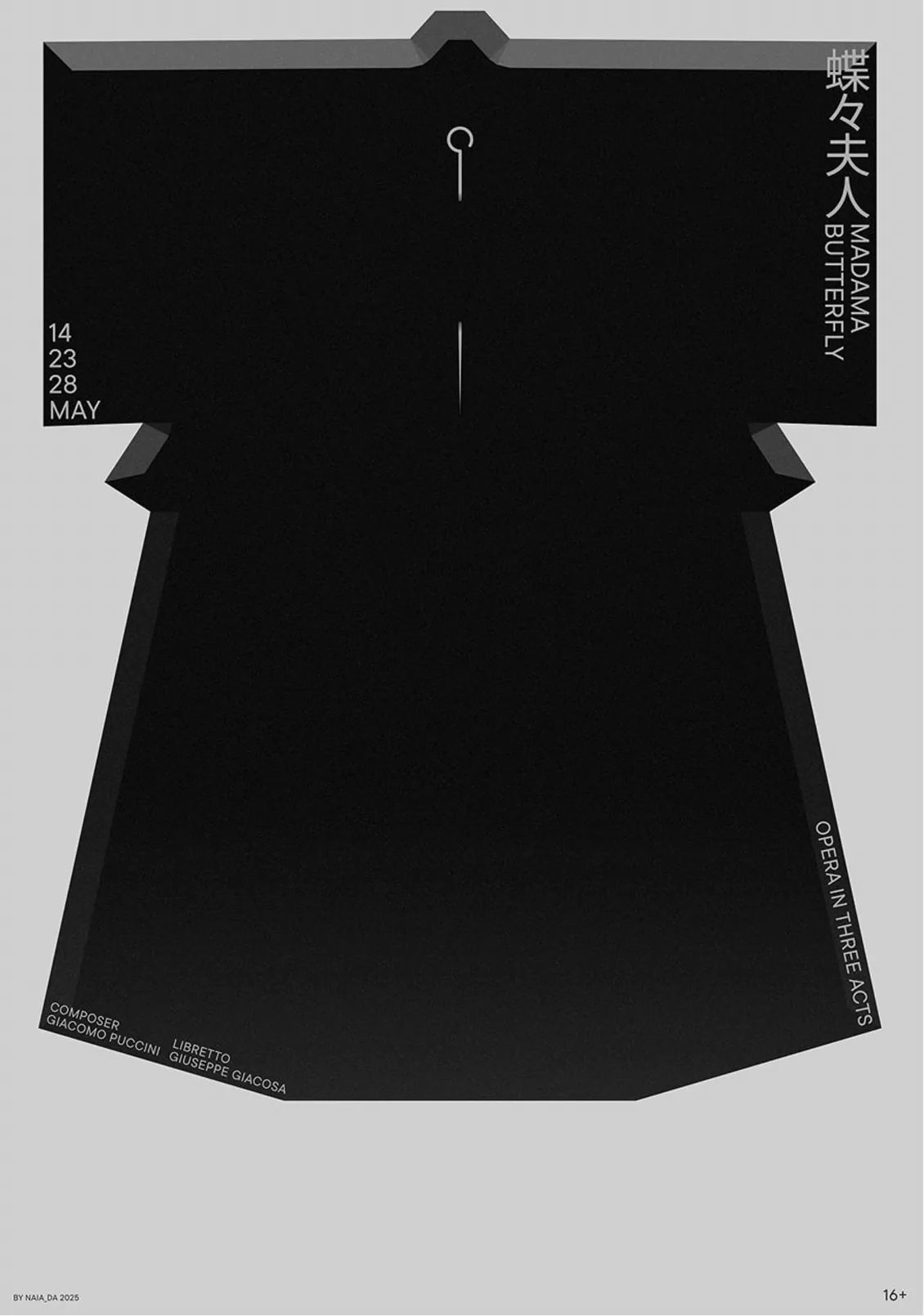
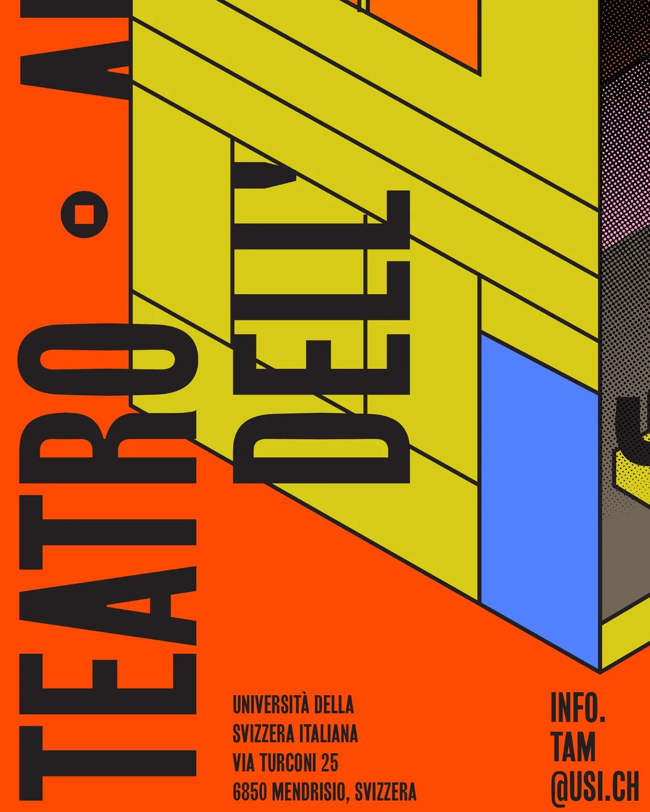
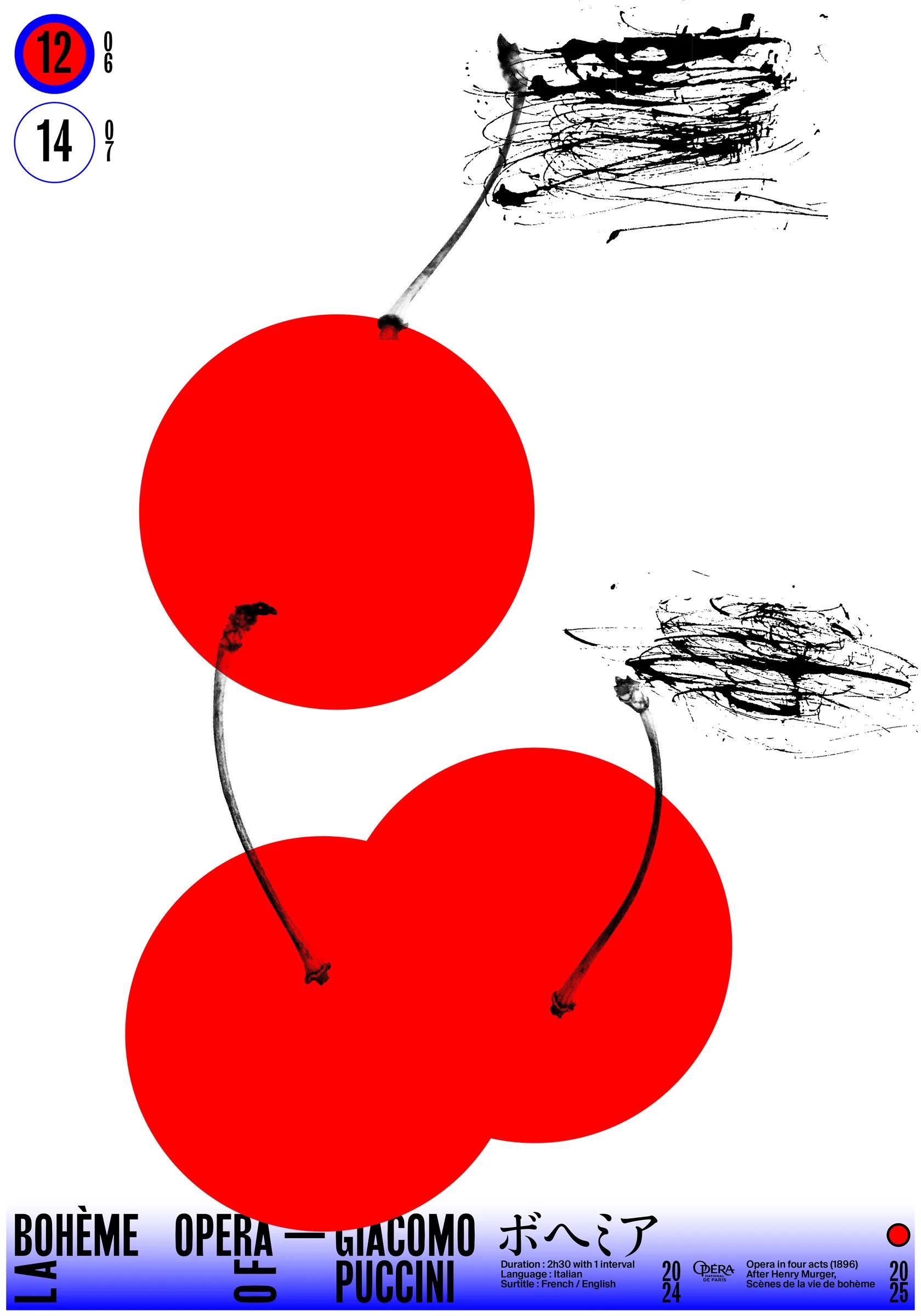
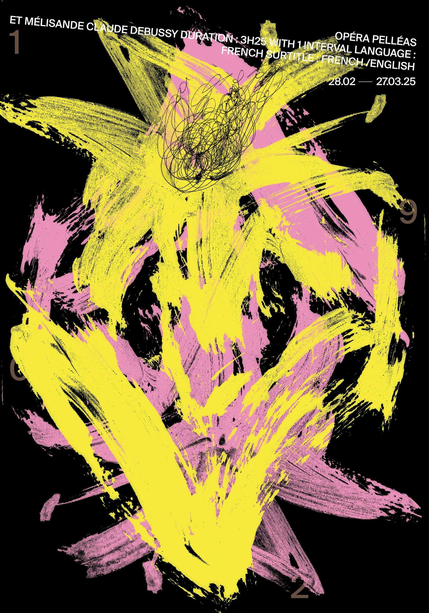
A circle, reduced far enough, can stand in for an entire opera season; a line can become a waterfall. Anastasia Temirkhan, based in Lugano, builds posters, identities and creative direction for cultural institutions, coffee roasters and record labels across Europe, the Middle East and South Korea out of exactly that kind of compression. The reach of the idea shows in a recent commission for Hamburg's Thalia Theatre production of “Legend,” directed by Kirill Serebrennikov, its imagery drawn from Sergei Parajanov's film “The Colour of Pomegranates”: proof that reduction travels well past a festival identity and onto a European stage.
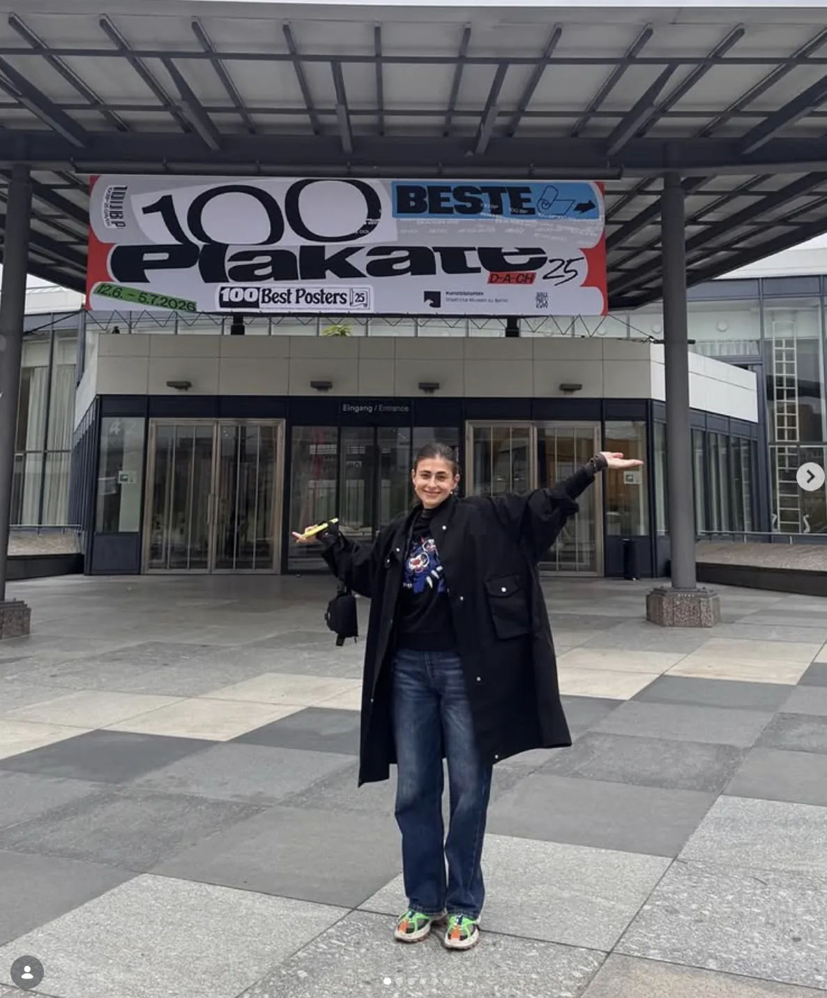
She trained at the Bankov Poster School in Prague under Peter Bankov, counts Anna Kulachek and Mikhail Lychkovskiy among her mentors, and went on to Dafi Kühne's Typographic Printing Program, a Weltformat Festival workshop, a Design Summer in Hangzhou and an AGI Congress in Basel. The work has since collected Graphis Platinum awards, Poster Stellars gold and silver medals, five Excellent Work selections at TDC Tokyo, a Golden Bee selection, a bronze at the Nanjing poster biennial, and multiple 100 Best Posters selections across Switzerland, Germany and Austria, with features in Design 360°, Bold Journey and People of Print; in 2025 she lectured at ESAD Porto's Semantic Shapes Conference.
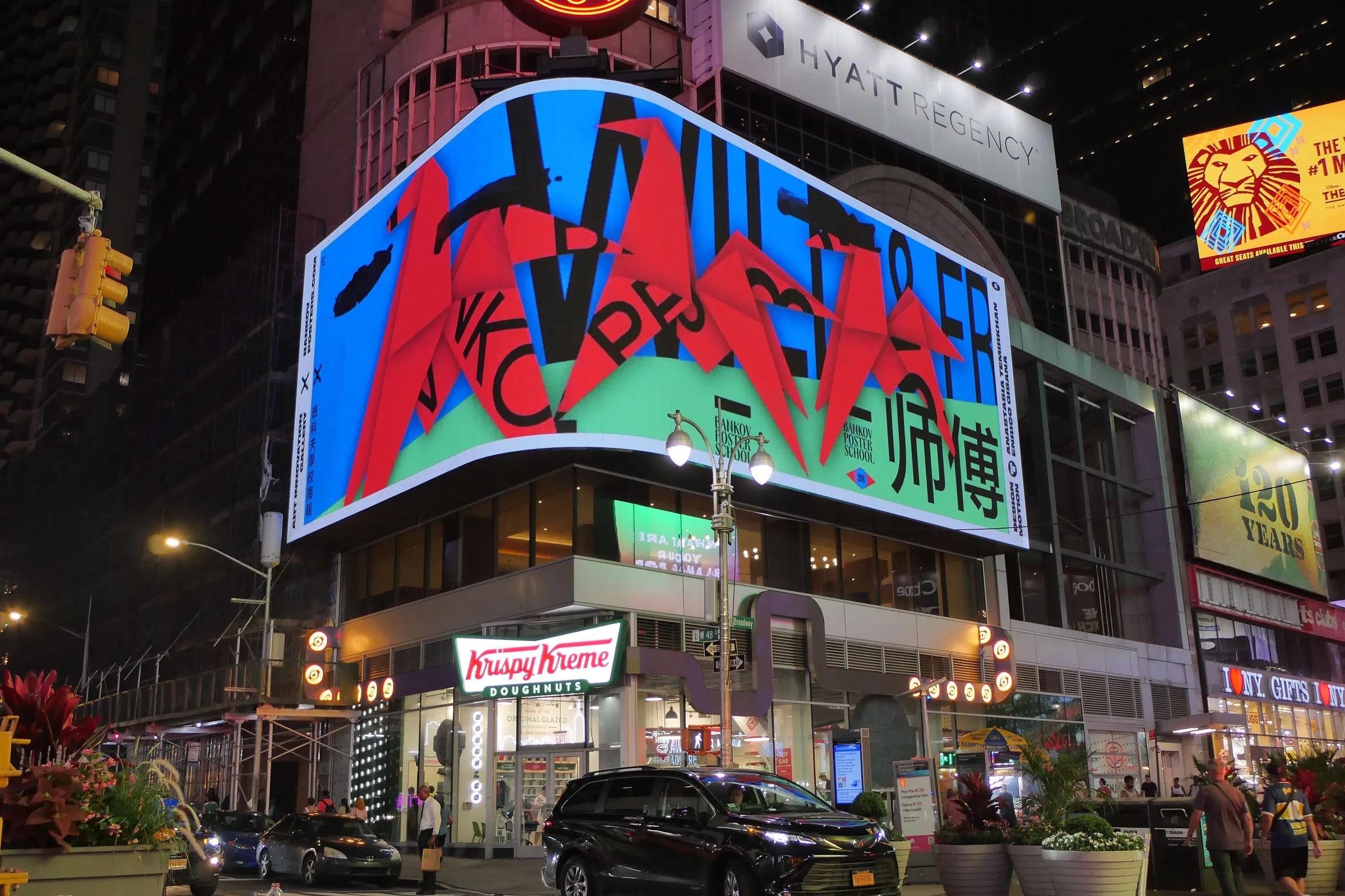
In 2025 she co-organised, with Mikhail Lychkovskiy, the Bankov Poster School's fifth-anniversary anthology on Times Square, contributing “Where ideas run free & wild” with motion designer Enrico Gisana — since awarded a Communication Arts Award of Excellence. “Being a designer means living in a state of continuous voyage,” she has said. “Creative work at its best is a dialogue: between mentors, collaborators, viewers, cultures and ideas.”
Why we like it: even blown up forty feet over Times Square, her instinct to reduce first and let the pattern argue its own case still holds.


artist
Anastasia Temirkhan
A circle, reduced far enough, can stand in for an entire opera season; a line can become a waterfall. Anastasia Temirkhan, based in Lugano, builds posters, identities and creative direction for cultural institutions, coffee roasters and record labels across Europe, the Middle East and South Korea out of exactly that kind of compression. The reach of the idea shows in a recent commission for Hamburg's Thalia Theatre production of “Legend,” directed by Kirill Serebrennikov, its imagery drawn from Sergei Parajanov's film “The Colour of Pomegranates”: proof that reduction travels well past a festival identity and onto a European stage.
She trained at the Bankov Poster School in Prague under Peter Bankov, counts Anna Kulachek and Mikhail Lychkovskiy among her mentors, and went on to Dafi Kühne's Typographic Printing Program, a Weltformat Festival workshop, a Design Summer in Hangzhou and an AGI Congress in Basel. The work has since collected Graphis Platinum awards, Poster Stellars gold and silver medals, five Excellent Work selections at TDC Tokyo, a Golden Bee selection, a bronze at the Nanjing poster biennial, and multiple 100 Best Posters selections across Switzerland, Germany and Austria, with features in Design 360°, Bold Journey and People of Print; in 2025 she lectured at ESAD Porto's Semantic Shapes Conference.
In 2025 she co-organised, with Mikhail Lychkovskiy, the Bankov Poster School's fifth-anniversary anthology on Times Square, contributing “Where ideas run free & wild” with motion designer Enrico Gisana — since awarded a Communication Arts Award of Excellence. “Being a designer means living in a state of continuous voyage,” she has said. “Creative work at its best is a dialogue: between mentors, collaborators, viewers, cultures and ideas.”
Why we like it: even blown up forty feet over Times Square, her instinct to reduce first and let the pattern argue its own case still holds.
Artist
Anatolie Micaliuc

Anatolie Micaliuc is a product designer from Chisinau, Moldova. He got into design almost by accident, starting with landing pages and ad banners before moving on to startups like GoParrot and Oryx, and later to big tech at Square.
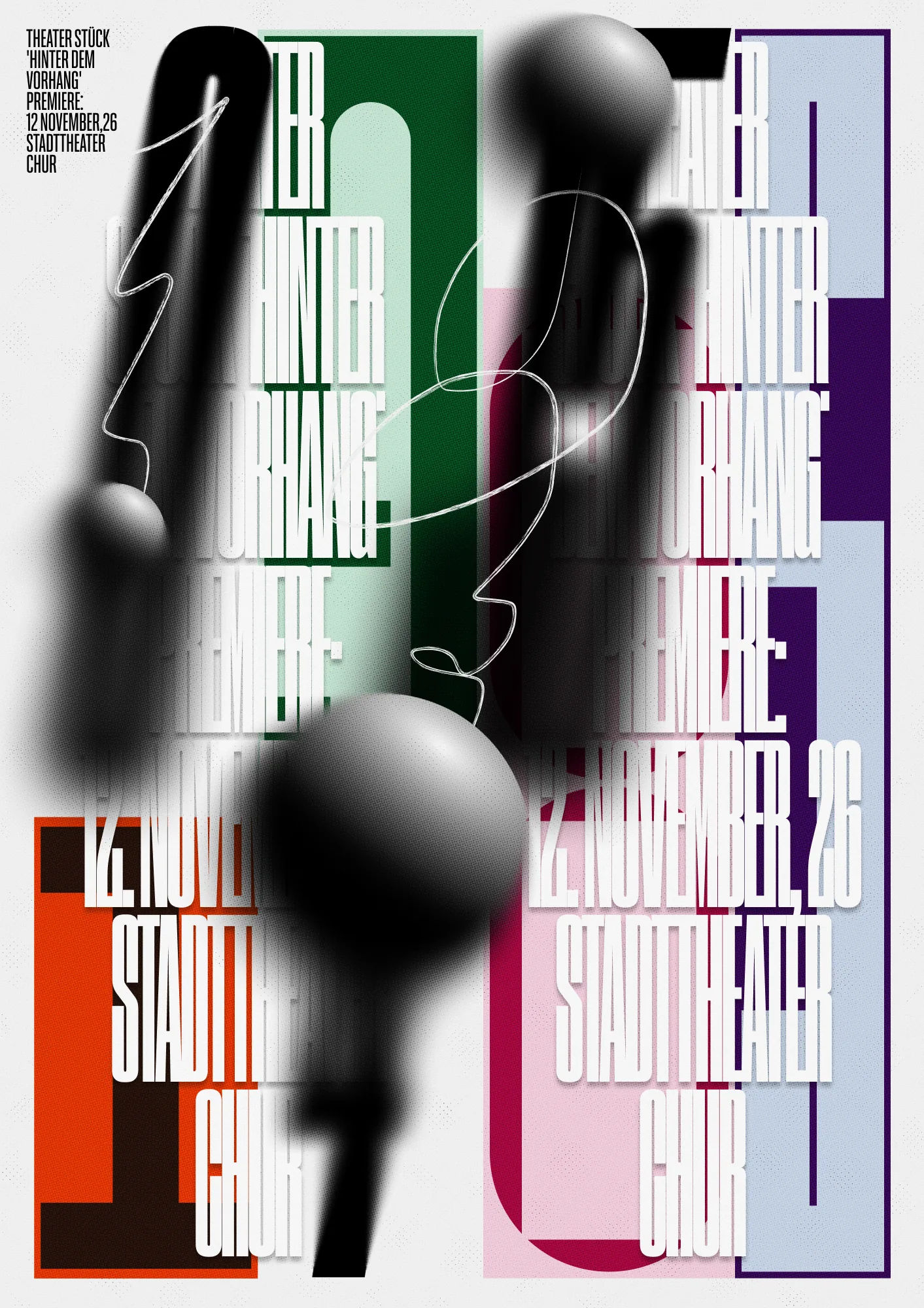
But posters have always been his real love. For Anatolie, poster design brings almost every graphic design discipline into one place. It’s where he goes to sharpen his eye and keep learning the craft.
Over the years, he has studied with Peter Bankov, Artem Matyushkin, Artem Gorbunov, Svyat Vishnyakov, Pavel Ripley, Ilya Birman, and many other great designers who shaped the way he thinks and works.
His work has appeared at TDC NY, and he was part of a Peter Bankov School group project created with other talented designers to celebrate the school’s fifth anniversary. The project was shown on Times Square and later received a Communication Arts Award. His posters have also been shown at festivals including SREDA, HEHU, Golden Bee, and others.
Why we like it: a product designer who measures success in MRR by day and in ten-point kerning by night, and refuses to let either slide.
Find Anatolie online: Website · Instagram · LinkedIn · Behance




artist
Anatolie Micaliuc
Anatolie Micaliuc is a product designer from Chisinau, Moldova. He got into design almost by accident, starting with landing pages and ad banners before moving on to startups like GoParrot and Oryx, and later to big tech at Square.
But posters have always been his real love. For Anatolie, poster design brings almost every graphic design discipline into one place. It’s where he goes to sharpen his eye and keep learning the craft.
Over the years, he has studied with Peter Bankov, Artem Matyushkin, Artem Gorbunov, Svyat Vishnyakov, Pavel Ripley, Ilya Birman, and many other great designers who shaped the way he thinks and works.
His work has appeared at TDC NY, and he was part of a Peter Bankov School group project created with other talented designers to celebrate the school’s fifth anniversary. The project was shown on Times Square and later received a Communication Arts Award. His posters have also been shown at festivals including SREDA, HEHU, Golden Bee, and others.
Why we like it: a product designer who measures success in MRR by day and in ten-point kerning by night, and refuses to let either slide.
Find Anatolie online: Website · Instagram · LinkedIn · Behance
Artist
Anna Striuk
Put Anna Striuk’s client work next to her one truly free project and you would swear two different designers made them. By day she gives hospitality brands their sense of place — campaigns and identities for Fontainebleau (including its BleauLive entertainment arm, host to acts like Lady Gaga and Calvin Harris), SLS, Baha Mar, Turnberry Isle Racquet Club, Harry Soffer Room and West Chelsea Contemporary, plus a custom-lettering campaign for a Nike retro line. She built that range across agency and independent practice in Miami, and works today as Senior Graphic Designer/Art Director at Hi-gloss, after earlier stints at RFR Creative and Outlast Life in Jacksonville.
Then came a brief with nothing in it. “Magic Playground”, made with animator Ivan Buka, was her entry in the Bankov Poster School’s fifth-anniversary anthology — a poster that behaves like a toy rather than a client deliverable. It ran on Times Square in June 2025 as part of Art Innovation Gallery’s “Twice Seen” exhibition, drew coverage from PRINT Magazine’s Daily Heller column, People of Print and Fonts In Use, and picked up a Communication Arts Award of Excellence in 2026 for Group Project.
Why we like it: the same designer who makes luxury look effortless clearly enjoys making a mess when nobody’s paying — and the judges agreed the mess was worth watching.
artist
Anna Striuk
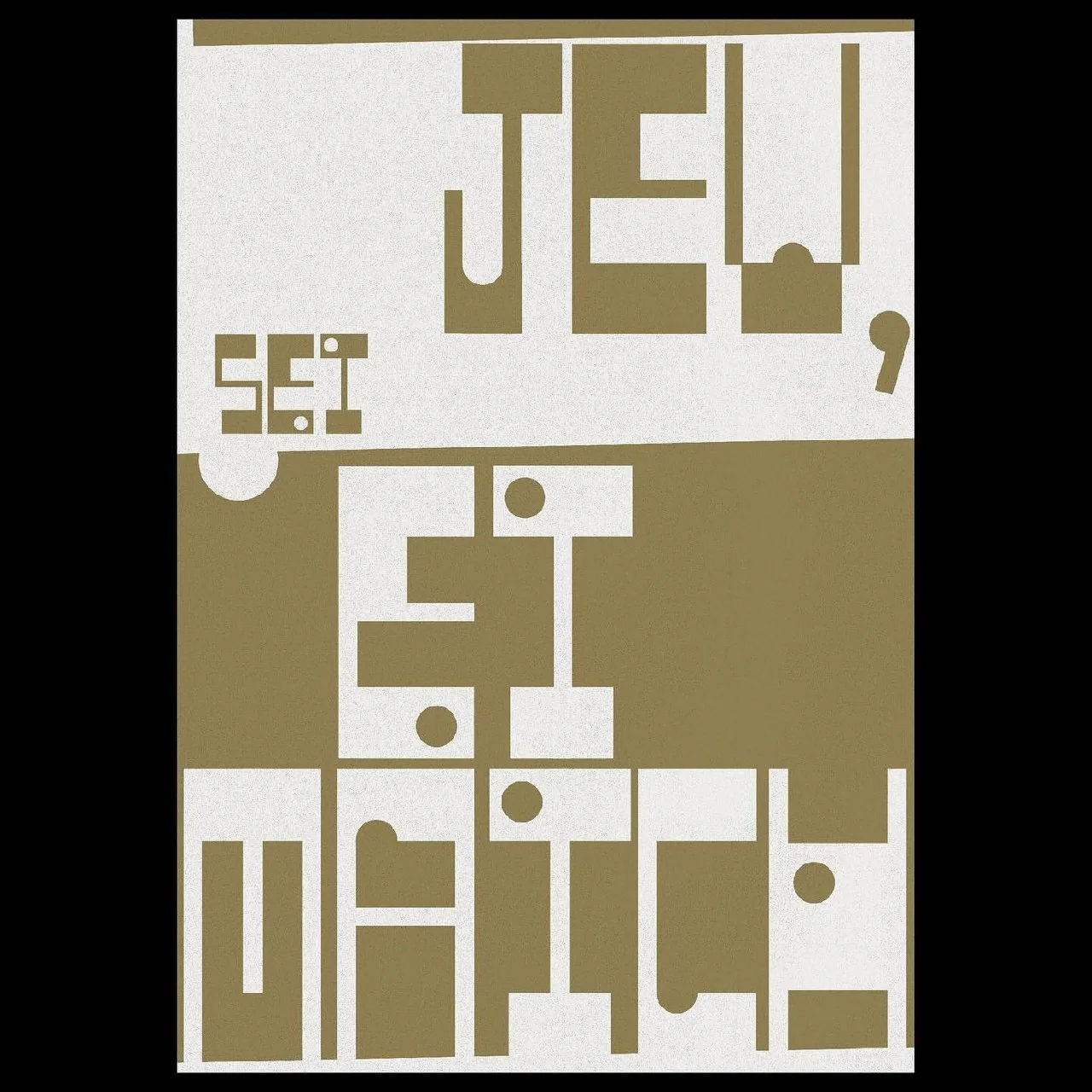
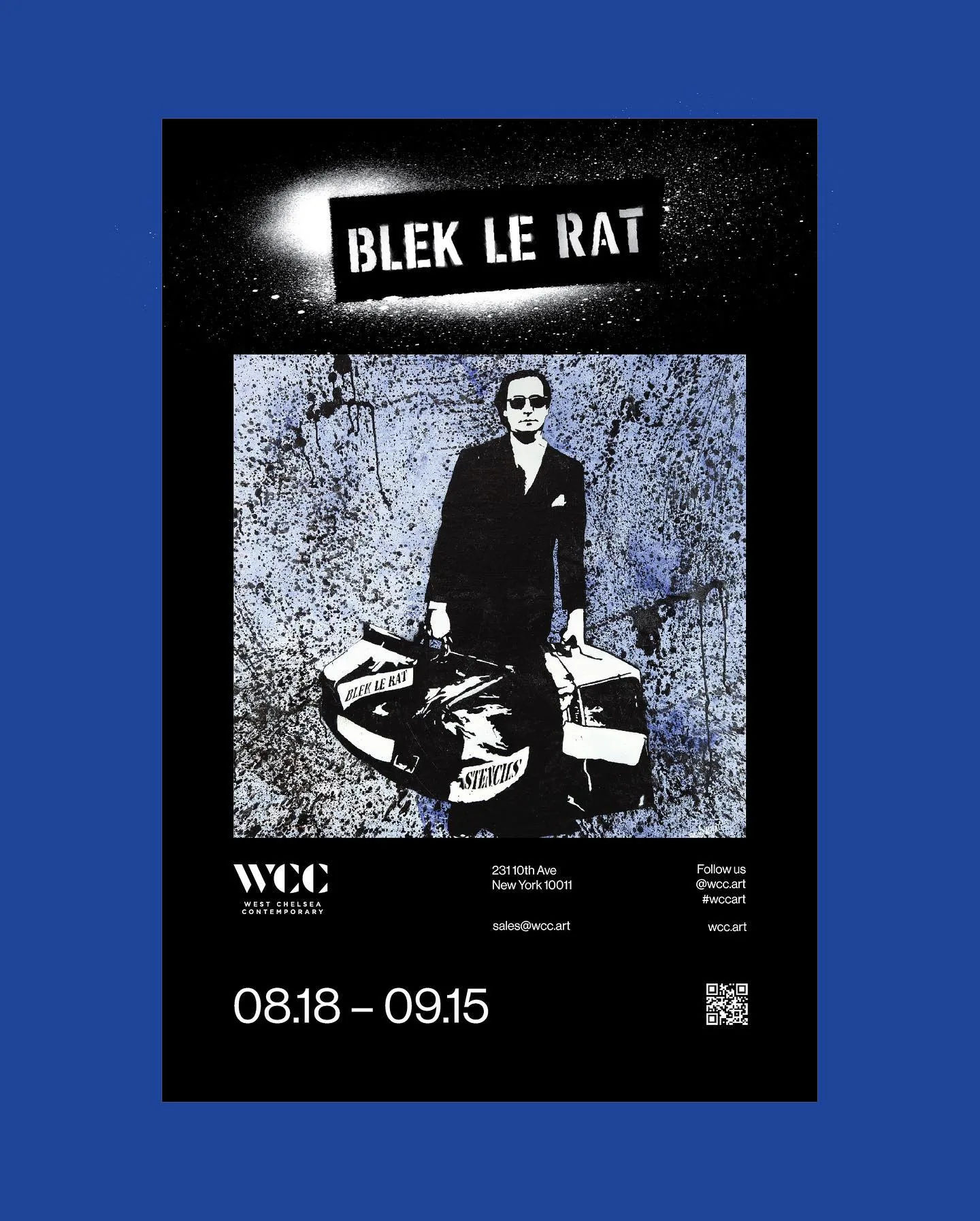
Put Anna Striuk’s client work next to her one truly free project and you would swear two different designers made them. By day she gives hospitality brands their sense of place — campaigns and identities for Fontainebleau (including its BleauLive entertainment arm, host to acts like Lady Gaga and Calvin Harris), SLS, Baha Mar, Turnberry Isle Racquet Club, Harry Soffer Room and West Chelsea Contemporary, plus a custom-lettering campaign for a Nike retro line. She built that range across agency and independent practice in Miami, and works today as Senior Graphic Designer/Art Director at Hi-gloss, after earlier stints at RFR Creative and Outlast Life in Jacksonville.
Then came a brief with nothing in it. “Magic Playground”, made with animator Ivan Buka, was her entry in the Bankov Poster School’s fifth-anniversary anthology — a poster that behaves like a toy rather than a client deliverable. It ran on Times Square in June 2025 as part of Art Innovation Gallery’s “Twice Seen” exhibition, drew coverage from PRINT Magazine’s Daily Heller column, People of Print and Fonts In Use, and picked up a Communication Arts Award of Excellence in 2026 for Group Project.
Why we like it: the same designer who makes luxury look effortless clearly enjoys making a mess when nobody’s paying — and the judges agreed the mess was worth watching.
Artist
Mikhail Lychkovskiy
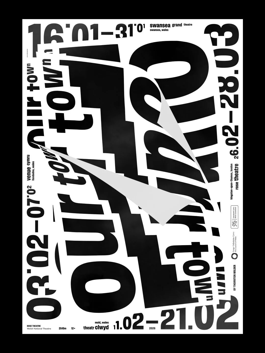
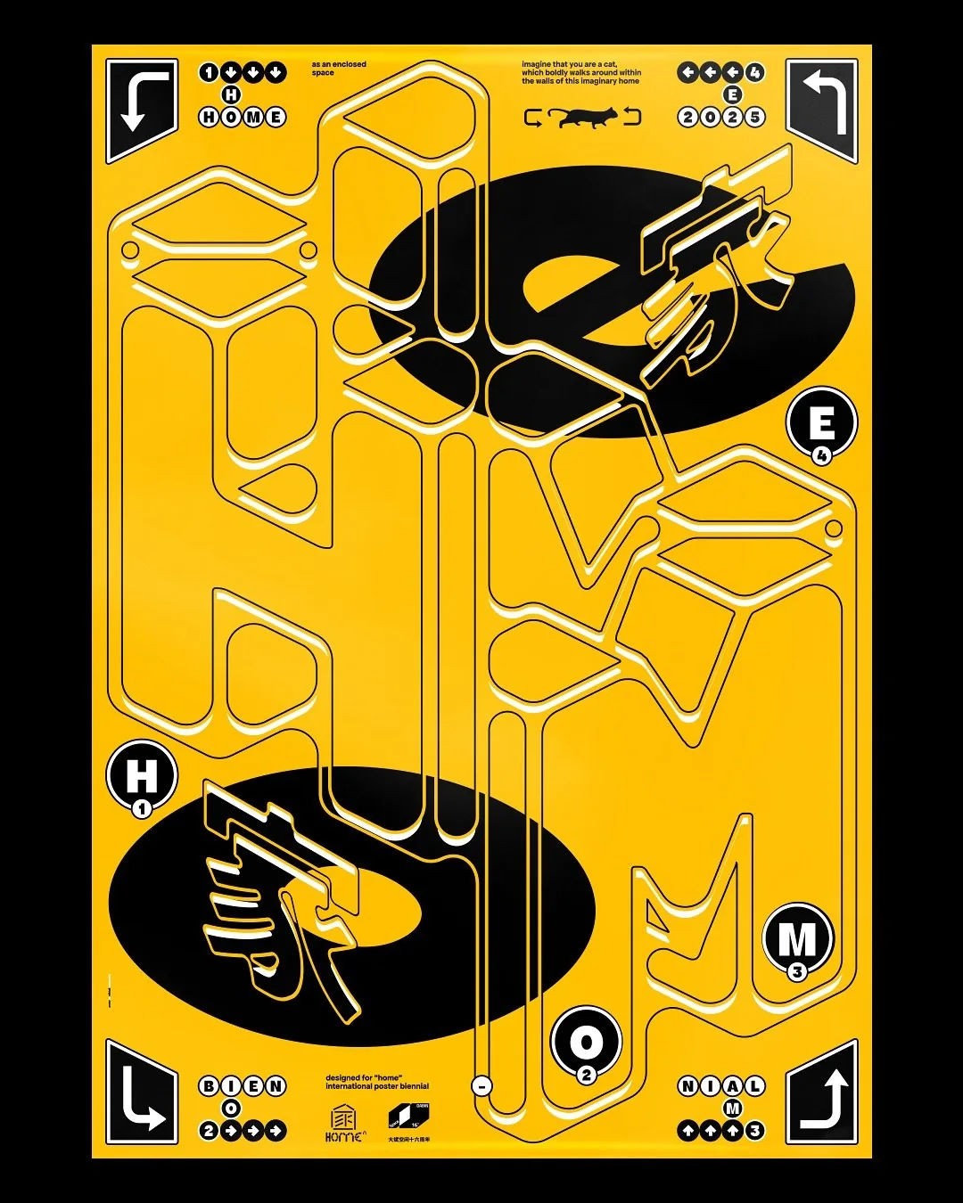
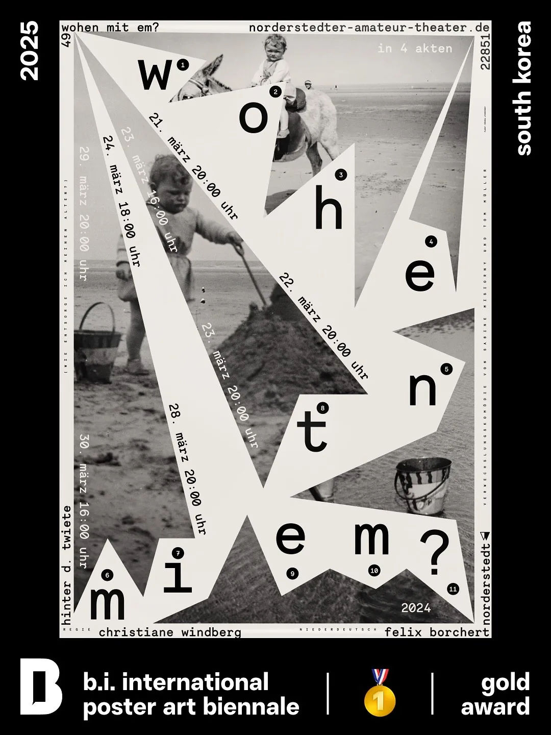
Mikhail Lychkovskiy is a contemporary graphic designer and poster artist, recognized for his work in typographic poster design. His creative practice centers on experimental typography, where written letters are treated simultaneously as linguistic information and standalone geometric or abstract structures. Lychkovskiy's stylistic approach frequently references and deconstructs Swiss, German, and French poster design traditions. After graduating from British Higher School of Art & Design he studied under Peter Bankov, who helped expand the range of techniques by improvised tools (broken matches, acrylic, glue gun and more).
Mikhail's posters are regularly selected for global design festivals and biennales. In 2024, he was featured as a guest designer at the Graphic Days festival in Turin, Italy. In March–April 2026, he held a solo exhibition titled ”Typoposterized” at the PANDA Platforma cultural center in Berlin, Germany, showcasing screen-printed works produced in collaboration with the Bankov Print Space in Prague.
His work has been exhibited at major international venues, including the Toyama International Poster Triennial (Japan), the Chaumont Poster Biennial (France) and now has been marked with more than 40 international awards, including TDC New York and Communication Arts Awards of Excellence. Member of People of Print.


artist
Mikhail Lychkovskiy
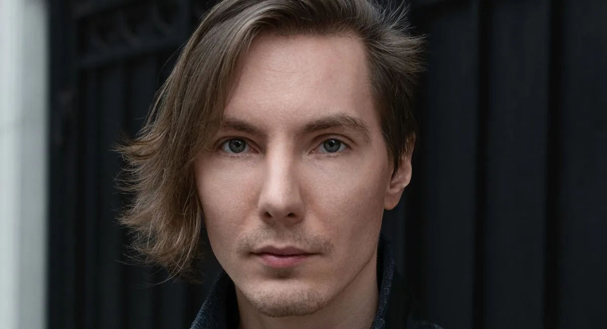
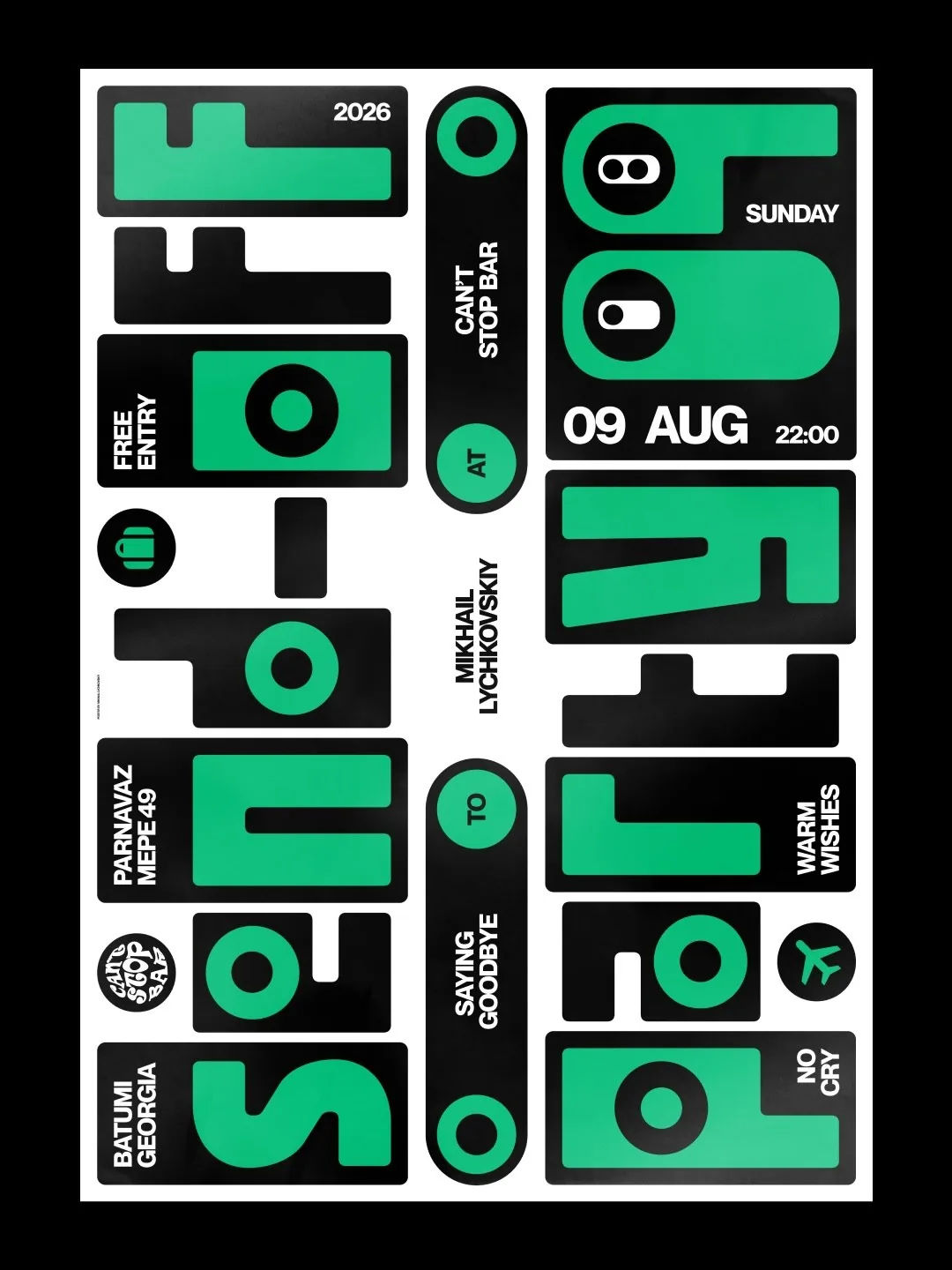
Mikhail Lychkovskiy is a contemporary graphic designer and poster artist, recognized for his work in typographic poster design. His creative practice centers on experimental typography, where written letters are treated simultaneously as linguistic information and standalone geometric or abstract structures. Lychkovskiy's stylistic approach frequently references and deconstructs Swiss, German, and French poster design traditions. After graduating from British Higher School of Art & Design he studied under Peter Bankov, who helped expand the range of techniques by improvised tools (broken matches, acrylic, glue gun and more).
Mikhail's posters are regularly selected for global design festivals and biennales. In 2024, he was featured as a guest designer at the Graphic Days festival in Turin, Italy. In March–April 2026, he held a solo exhibition titled ”Typoposterized” at the PANDA Platforma cultural center in Berlin, Germany, showcasing screen-printed works produced in collaboration with the Bankov Print Space in Prague.
His work has been exhibited at major international venues, including the Toyama International Poster Triennial (Japan), the Chaumont Poster Biennial (France) and now has been marked with more than 40 international awards, including TDC New York and Communication Arts Awards of Excellence. Member of People of Print.
Artist
Nelli Kam Chupin

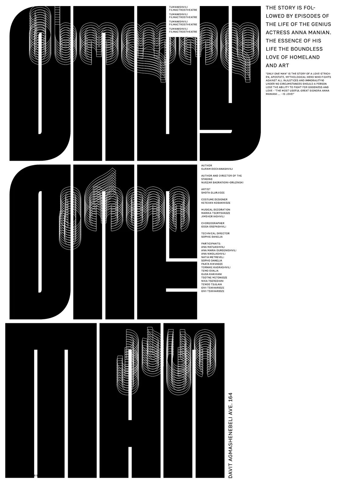
Before she ever drew a poster, Nelli Kam Chupin was coding radiation readings for satellite physicists — a maths degree and a computer-science habit of mind that never quite left her. She grew up moving between alphabets, and today moves between English, Georgian, French and Serbian with the same ease; her poster practice treats the world's writing systems the way a linguist treats grammar, not decoration but structure to bend. She has lived in several countries and is now based in Belgrade, with a second foothold in Tbilisi; along the way she trained at the Plantin Institute, University of Antwerp, at a type design school and at several poster schools, including Peter Bankov's.
The recognition has stacked up fast: Gold and Bronze at PosterStellars 2023, third prize at the International Poster Biennale in Lublin, a Communication Arts Design win in 2026 for the Bankov Poster School's Times Square anthology, and more than fifty selections across thirty-odd biennials spanning Europe, the Americas, Asia and the Middle East, from Lahti and Tokyo TDC to Madrid Gráfica, the B.I. Poster Biennale in Korea, the Ecuador Poster Bienal, the Emirates Poster Festival and Sofia's Stage Poster Triennial. Her series Poster4Peace, City Speaks and a run of jazz posters circulate alongside Goshuri, an experimental typeface of her own that made the pages of Slanted's Experimental Type issue; her work has also appeared in Slanted's “Posters Can Help” and in biennale catalogues.
Off the page she keeps building rooms for other people's obsessions: a club where members practise fourteen languages at once, the co-organised Poster Every Day, Tbilisi Posters — her project of posters and curated shows in the Georgian capital — the B44 space she runs in Belgrade, and the Formula art group and this very gallery, both co-founded by her. Influence, for her, shows in what grows up around a person, not just on their own wall.
Why we like it: she runs a gallery, a club that argues in fourteen languages, and a jazz-poster habit, and none of it seems to compete for the others' attention.


artist
Nelli Kam Chupin
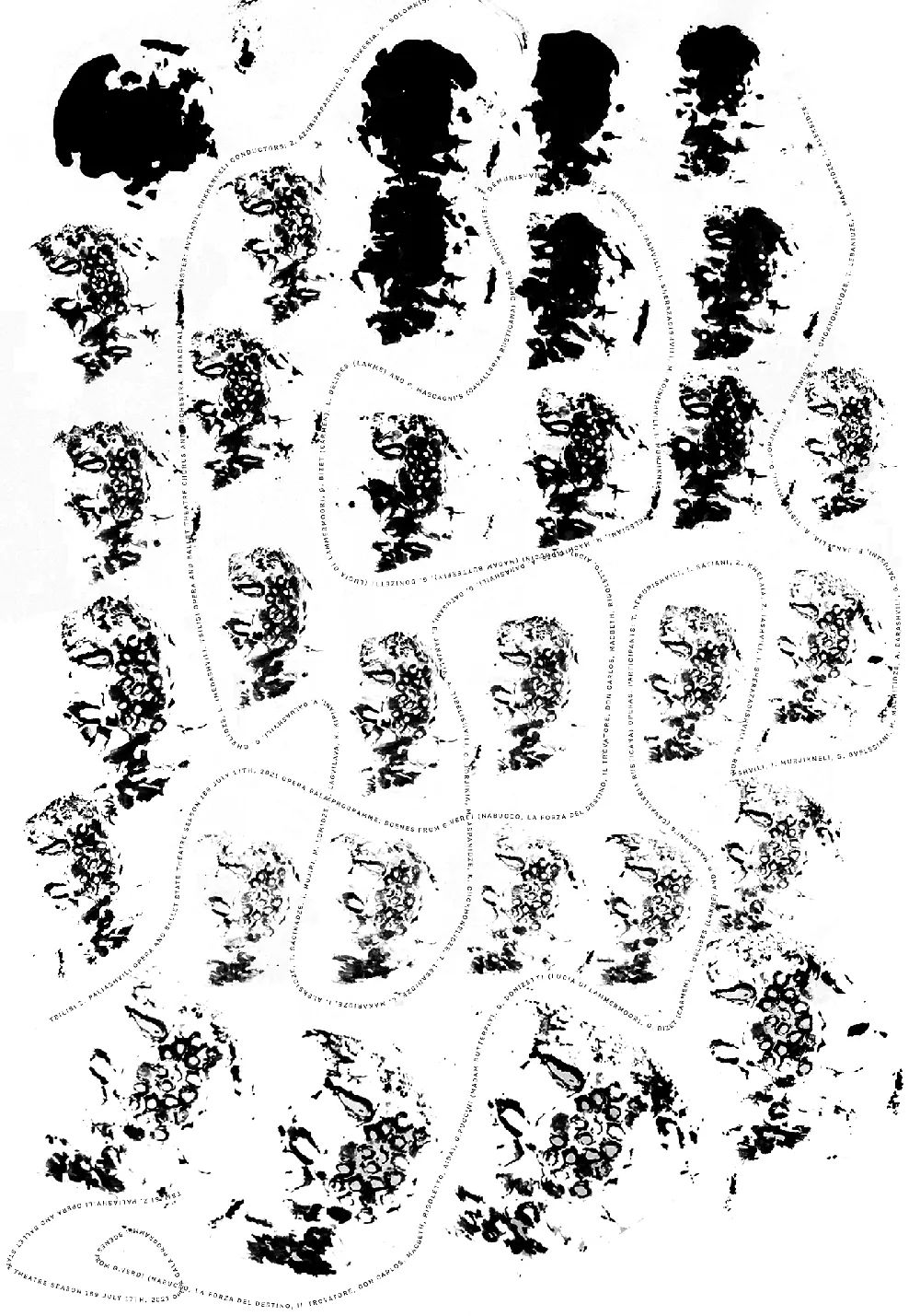
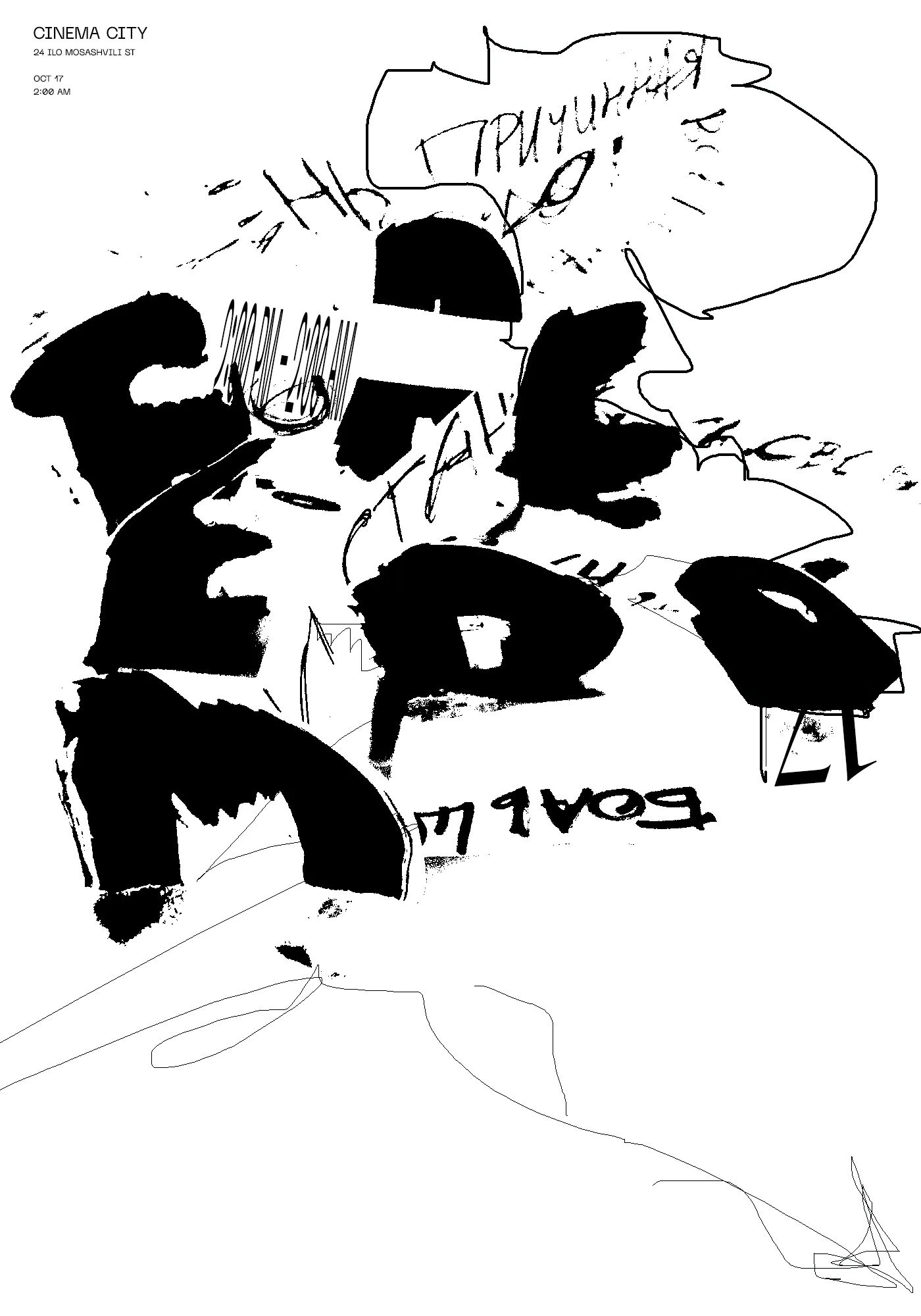
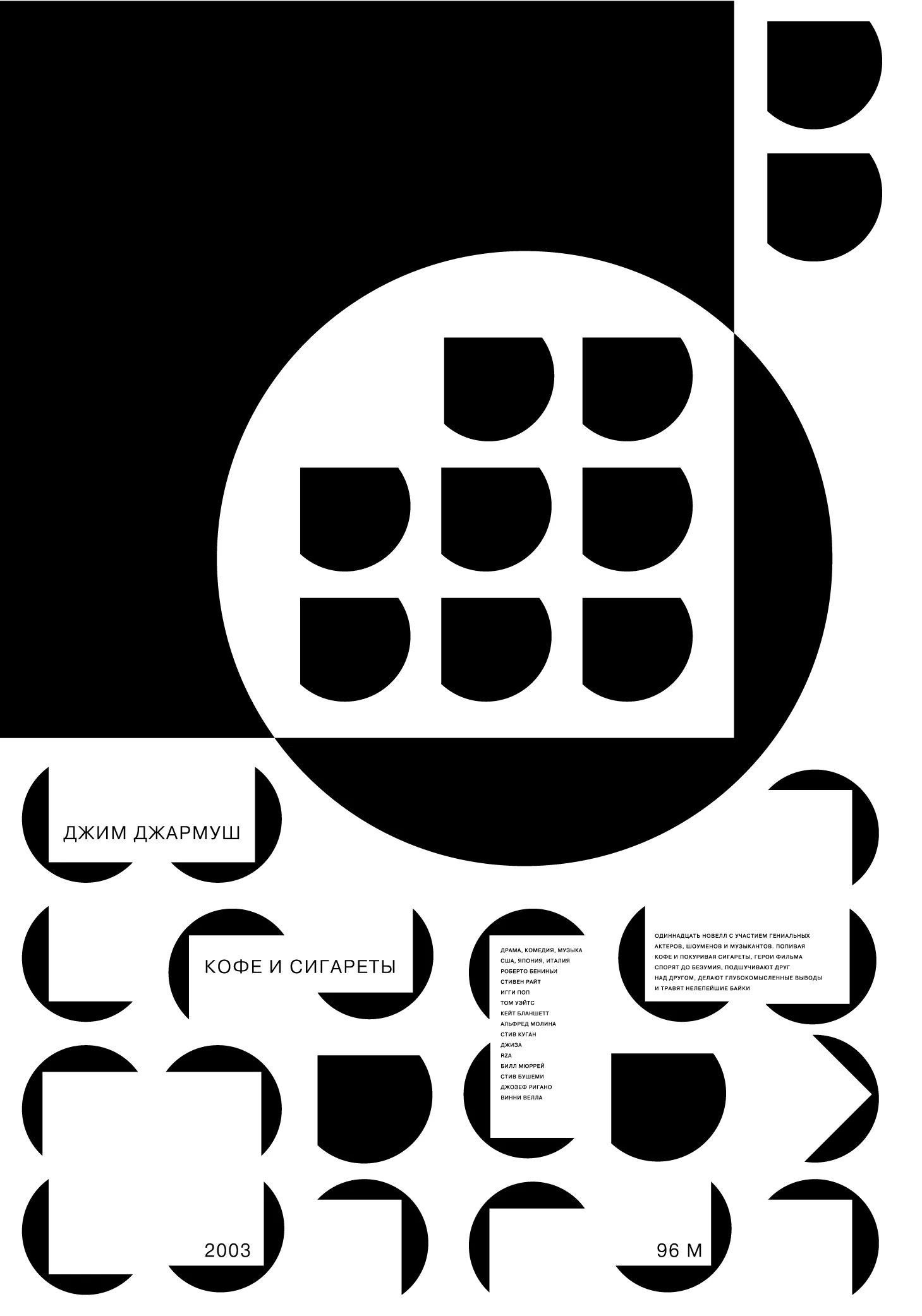
Before she ever drew a poster, Nelli Kam Chupin was coding radiation readings for satellite physicists — a maths degree and a computer-science habit of mind that never quite left her. She grew up moving between alphabets, and today moves between English, Georgian, French and Serbian with the same ease; her poster practice treats the world's writing systems the way a linguist treats grammar, not decoration but structure to bend. She has lived in several countries and is now based in Belgrade, with a second foothold in Tbilisi; along the way she trained at the Plantin Institute, University of Antwerp, at a type design school and at several poster schools, including Peter Bankov's.
The recognition has stacked up fast: Gold and Bronze at PosterStellars 2023, third prize at the International Poster Biennale in Lublin, a Communication Arts Design win in 2026 for the Bankov Poster School's Times Square anthology, and more than fifty selections across thirty-odd biennials spanning Europe, the Americas, Asia and the Middle East, from Lahti and Tokyo TDC to Madrid Gráfica, the B.I. Poster Biennale in Korea, the Ecuador Poster Bienal, the Emirates Poster Festival and Sofia's Stage Poster Triennial. Her series Poster4Peace, City Speaks and a run of jazz posters circulate alongside Goshuri, an experimental typeface of her own that made the pages of Slanted's Experimental Type issue; her work has also appeared in Slanted's “Posters Can Help” and in biennale catalogues.
Off the page she keeps building rooms for other people's obsessions: a club where members practise fourteen languages at once, the co-organised Poster Every Day, Tbilisi Posters — her project of posters and curated shows in the Georgian capital — the B44 space she runs in Belgrade, and the Formula art group and this very gallery, both co-founded by her. Influence, for her, shows in what grows up around a person, not just on their own wall.
Why we like it: she runs a gallery, a club that argues in fourteen languages, and a jazz-poster habit, and none of it seems to compete for the others' attention.
Artist
Nikita Gavrilenko
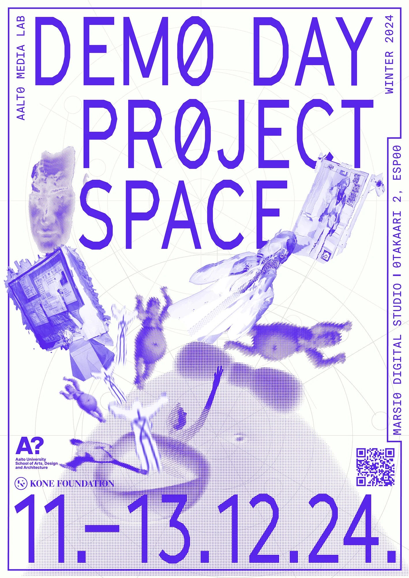
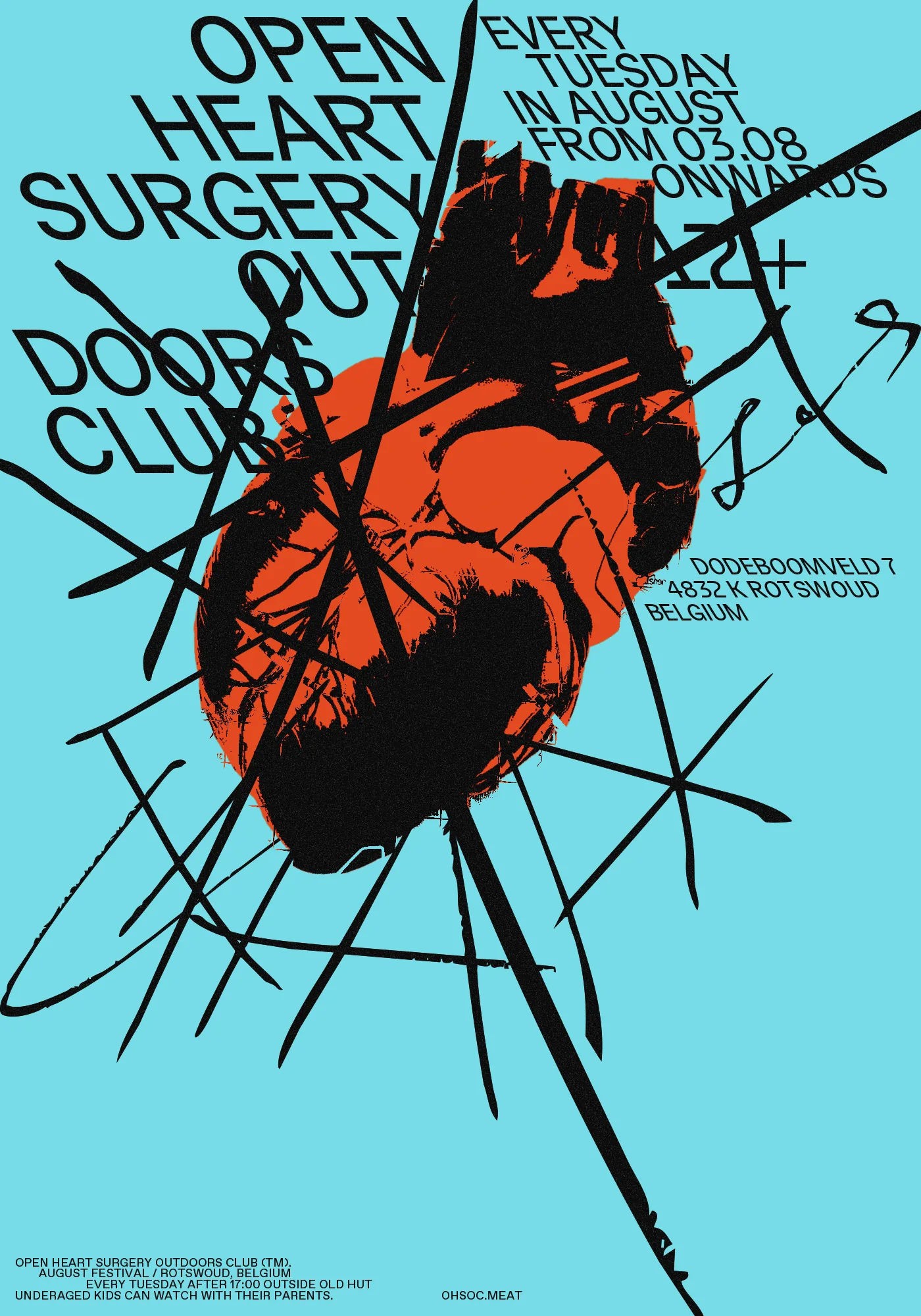
Nikita Gavrilenko trained to build aircraft, then to manage industry, before he ever trained to make a poster — a hairpin turn that puts him in company with more than a few designers in this gallery. He works now as a graphic designer and photographer out of Helsinki, Finland, having grown up in Kazakhstan, and is currently a Master’s student in Visual Communication Design at Aalto University and a member of Grafia, the Finnish association for visual communication designers.
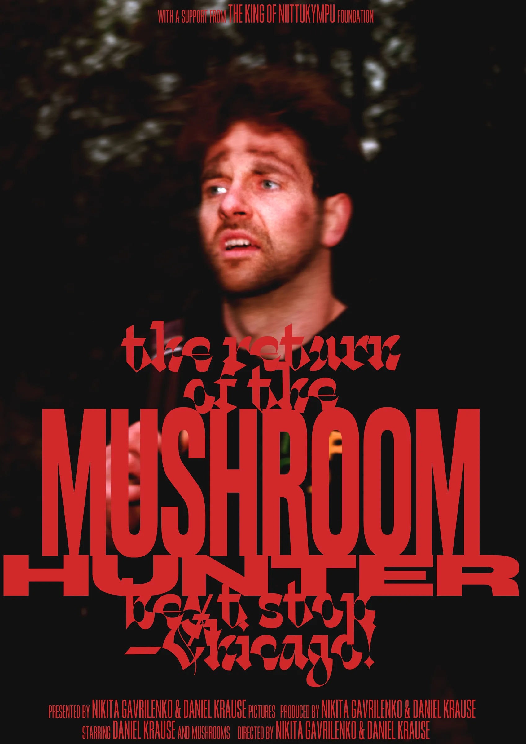
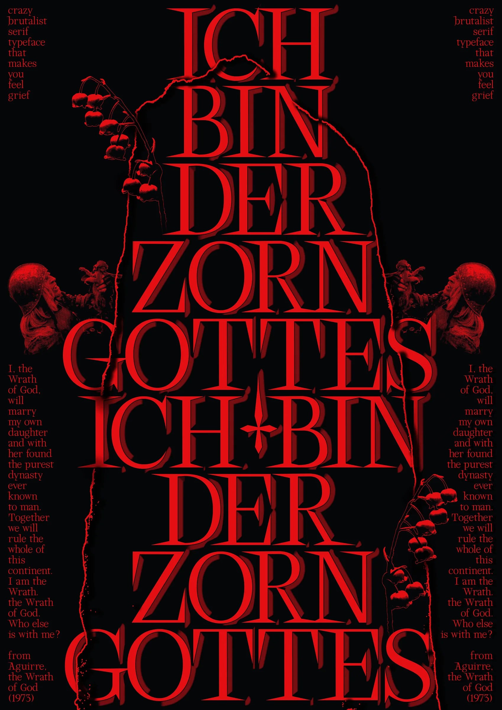
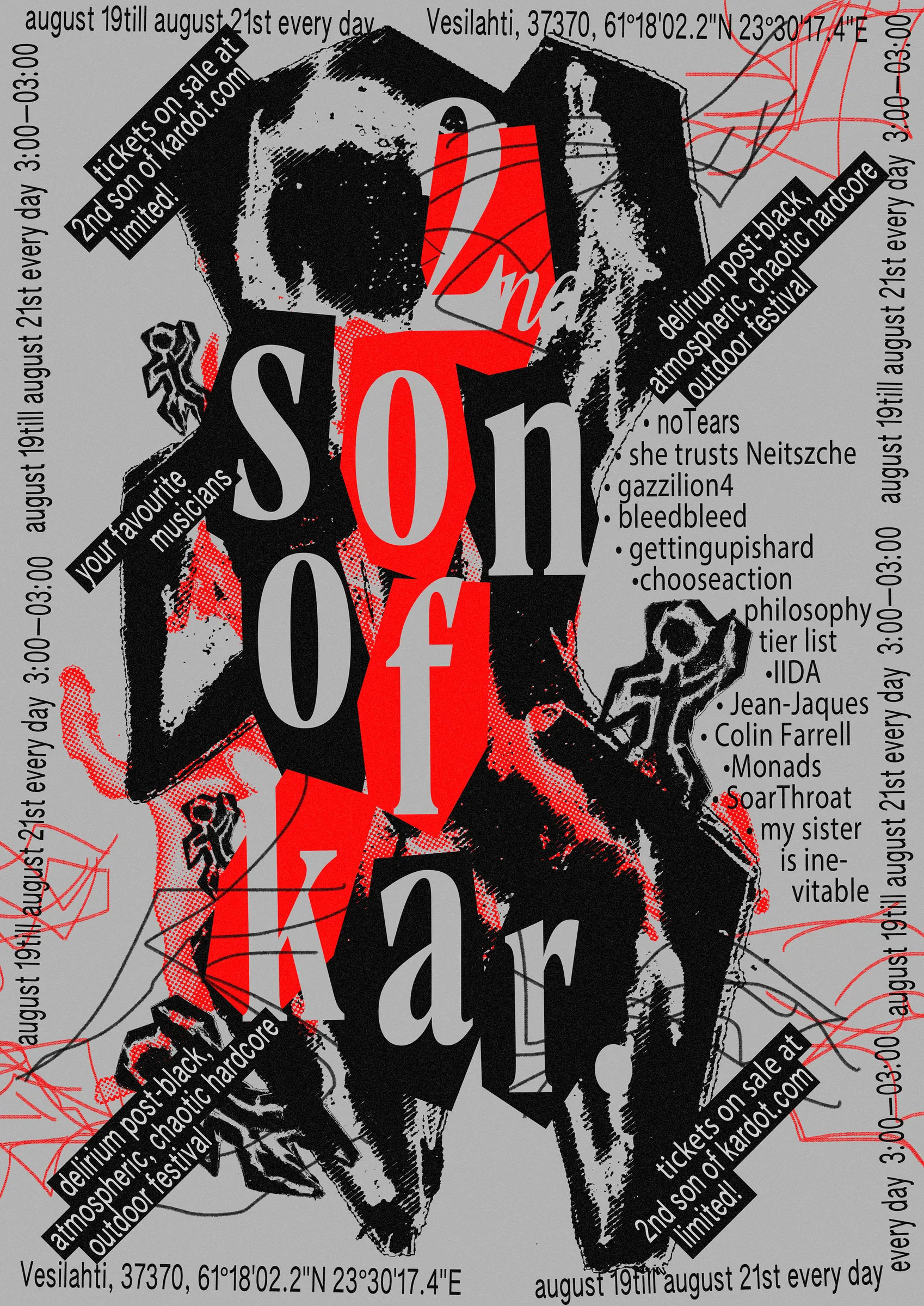
His posters move between the political and the deliberately absurd, and juries have noticed: “Young Military Expert Cartoon Club” and “Rap Ambush” were Poster Stellars 2023 finalists, alongside “I Am F*cking Wasted” in the Ecological category; “Ich Bin Der Zorn Gottes” and “Omega VR Time Travel Company” made the Poster Stellars 2024 finalist list a year later.
For “Poster Fighter”, he paired with Japanese artist Nanako Ueda on a joint exhibition of posters inspired by medieval Asian warriors and martial arts, shown at Luonnos-ikkuna in Helsinki from January to April 2025 — a Kazakhstan-raised designer and a Japan-born one meeting in the middle on a shared visual language of combat and armour, which is as good a case as any for what a poster can do that a paragraph can’t. His anthology piece, “Catching the Big Fish”, set in CoFo Kak and CoFo Sans Mono, ran in the Bankov Poster School’s fifth-anniversary show on Times Square in June 2025.
Why we like it: it takes David Lynch’s line about ideas literally and goes fishing.

artist
Nikita Gavrilenko
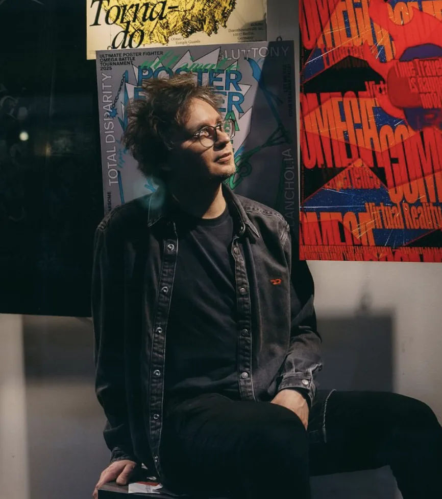
Nikita Gavrilenko trained to build aircraft, then to manage industry, before he ever trained to make a poster — a hairpin turn that puts him in company with more than a few designers in this gallery. He works now as a graphic designer and photographer out of Helsinki, Finland, having grown up in Kazakhstan, and is currently a Master’s student in Visual Communication Design at Aalto University and a member of Grafia, the Finnish association for visual communication designers.
His posters move between the political and the deliberately absurd, and juries have noticed: “Young Military Expert Cartoon Club” and “Rap Ambush” were Poster Stellars 2023 finalists, alongside “I Am F*cking Wasted” in the Ecological category; “Ich Bin Der Zorn Gottes” and “Omega VR Time Travel Company” made the Poster Stellars 2024 finalist list a year later.
For “Poster Fighter”, he paired with Japanese artist Nanako Ueda on a joint exhibition of posters inspired by medieval Asian warriors and martial arts, shown at Luonnos-ikkuna in Helsinki from January to April 2025 — a Kazakhstan-raised designer and a Japan-born one meeting in the middle on a shared visual language of combat and armour, which is as good a case as any for what a poster can do that a paragraph can’t. His anthology piece, “Catching the Big Fish”, set in CoFo Kak and CoFo Sans Mono, ran in the Bankov Poster School’s fifth-anniversary show on Times Square in June 2025.
Why we like it: it takes David Lynch’s line about ideas literally and goes fishing.
Artist
Peter Bankov
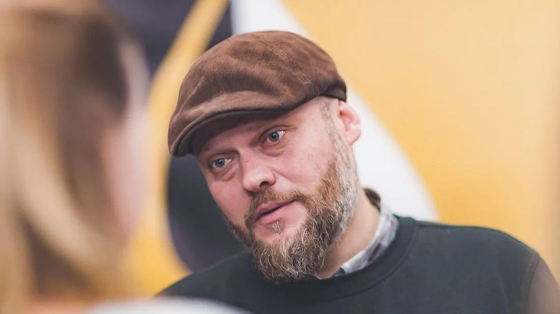
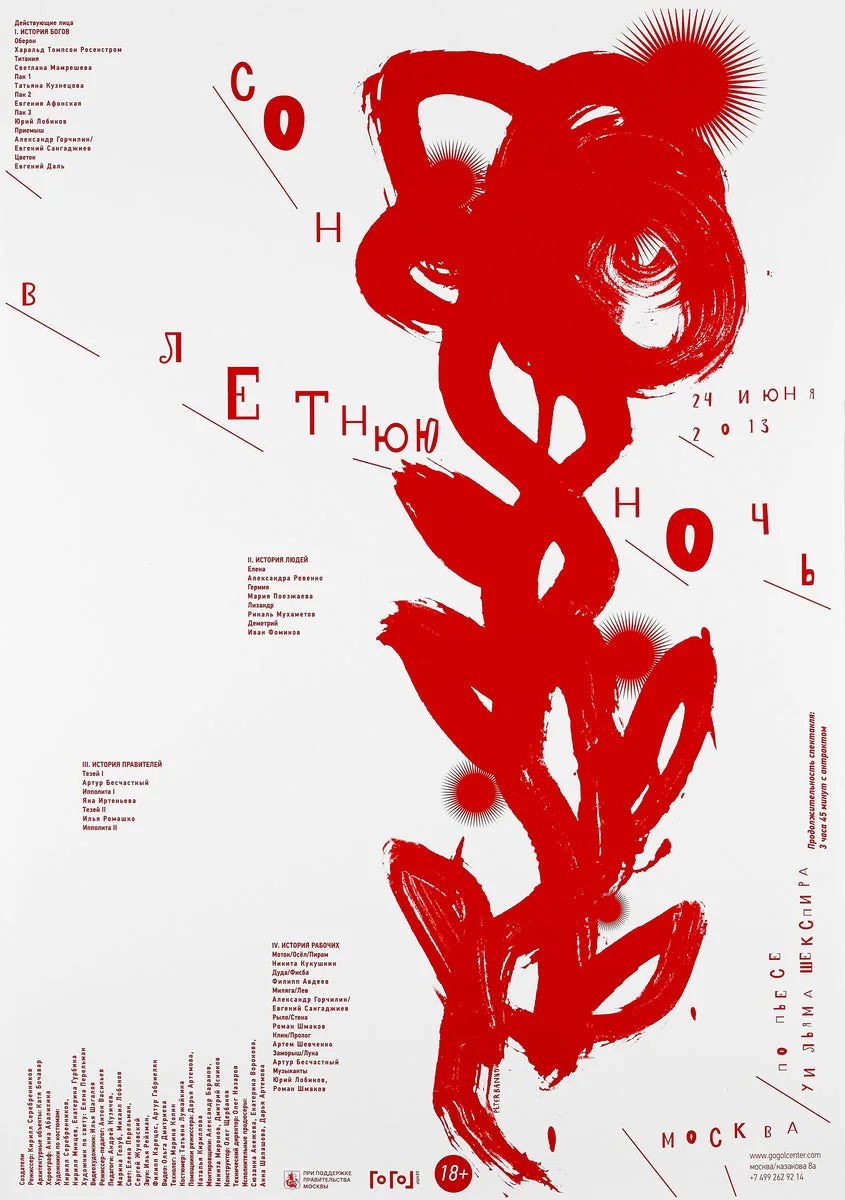
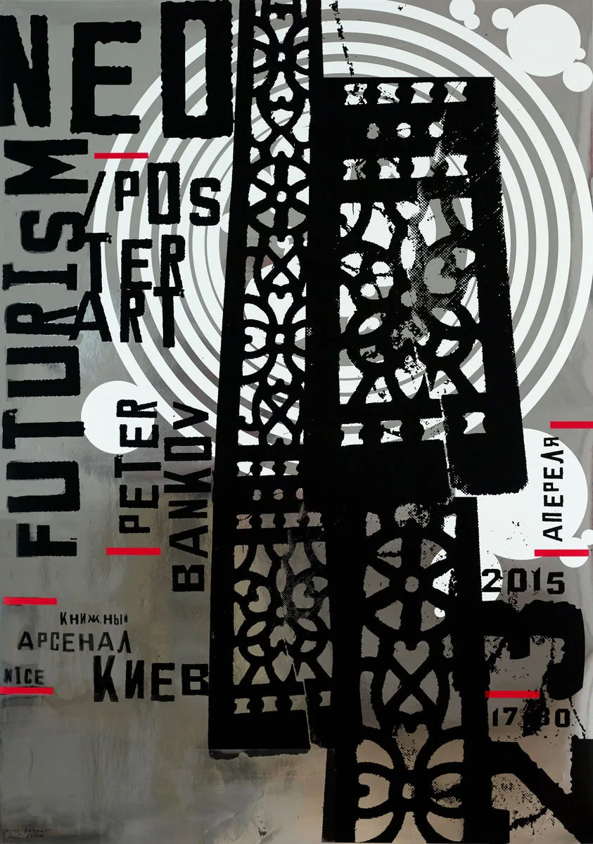
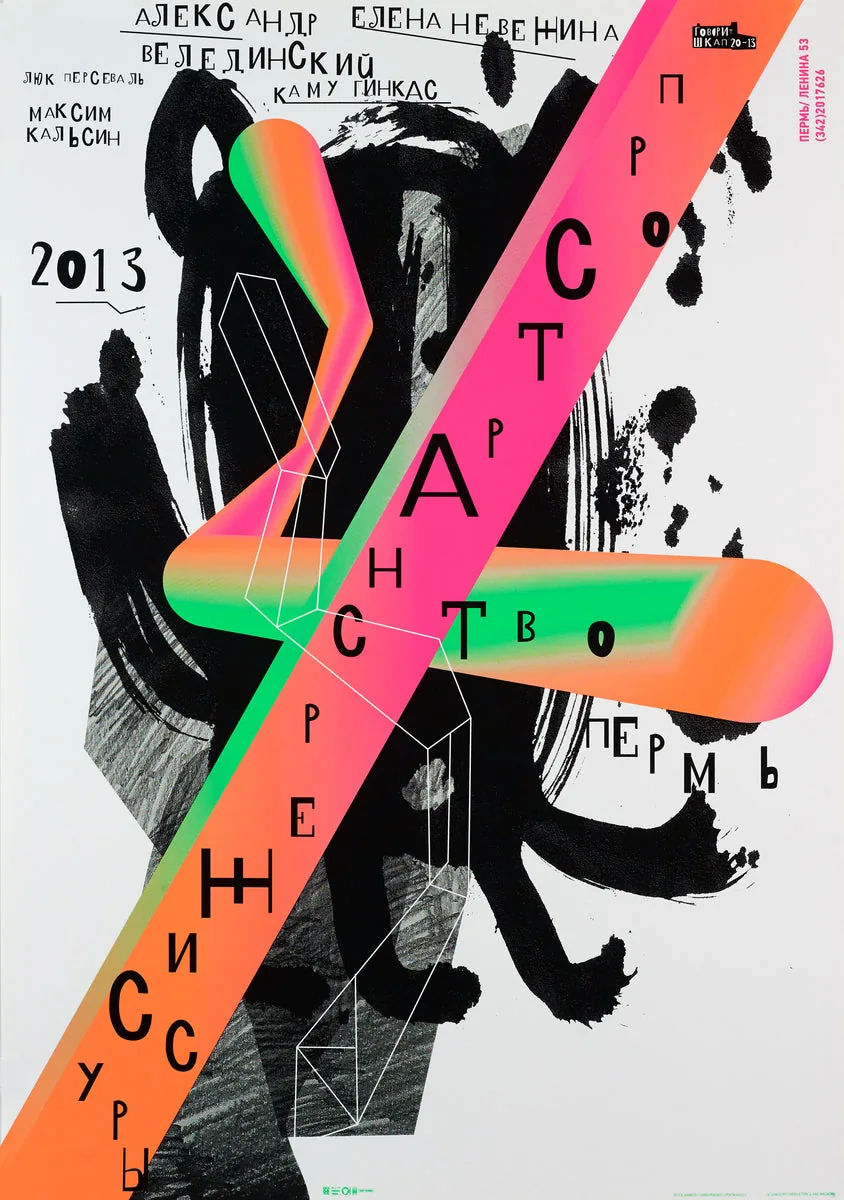
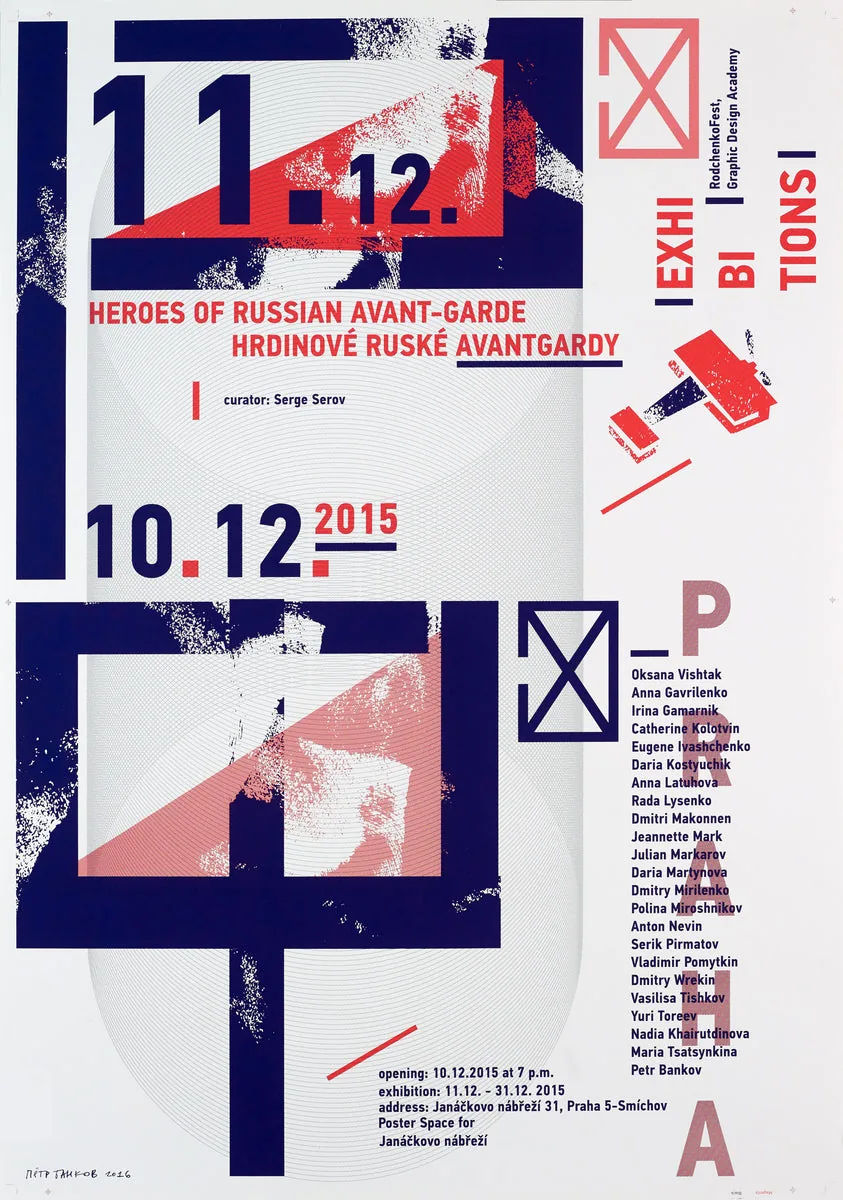
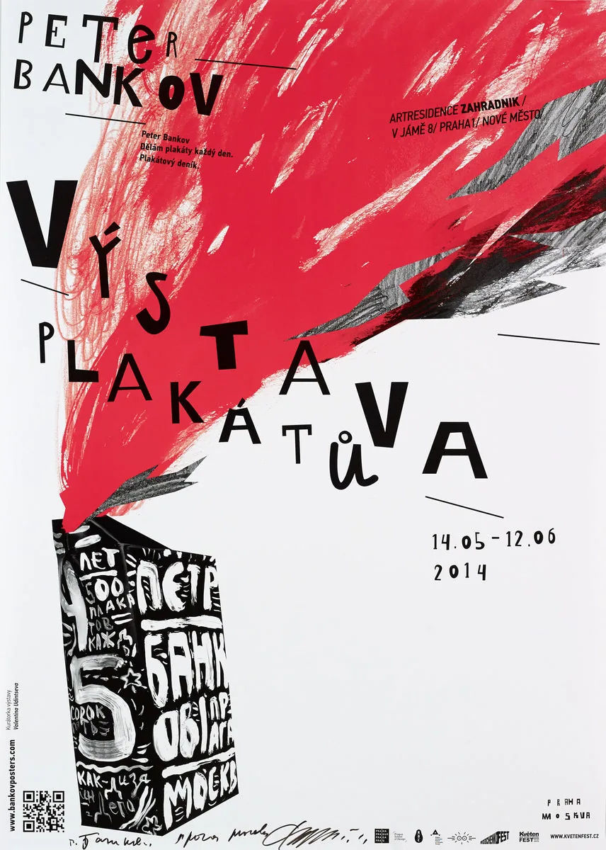
Two thousand and fifty-six posters, and Peter Bankov is still counting. He calls himself “a poster-making robot”, though the work reads nothing like it: expressive collage, type bruised on purpose, nothing polite. Born in Minsk in 1969 to a family of artists, he names his father, a painter who abandoned a career designing heavy machinery, as the influence he returns to first. He trained in sculpture at Minsk Art College, then in book design at a polygraphic institute, before settling in Prague. He is a member of AGI, the Alliance Graphique Internationale, and founded the design magazine [kAk); his posters now hang in MoMA, the Louvre and the Stedelijk.
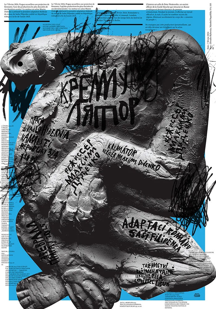
The circuit has noticed: a Silver Medal at the 29th Warsaw International Poster Biennale in 2025 for “Kremuliator”, Jury Prizes at the Golden Bee biennale in 2014 and 2018, Gold at the Italian Poster Biennial in Finale Ligure in 2015, a Grand Prix in Seoul, and a Red Dot Award for “War No More”, pairing wartime poems with gouache portraits drawn from his own childhood memories of veterans. Steven Heller has featured him in both “Graphic: 500 Designs that Matter” and “Graphic Design Rants and Raves”; Bankov wrote his own account, “I Make Posters Every Day”, and Graphis profiled him as a Master under the heading “Design is Happiness”.
Five years ago he opened the Bankov Poster School in Prague; almost every artist in this Journal passed through it, proof that one teacher in one studio can set a visual vocabulary well past his own front door. In June 2025, twelve of its alumni put an anthology of motion posters up on the screens of Times Square, titled “No Clients. No Briefs. No Limits.”, a tribute to a teacher they credit with a love of aesthetics, a sense of humour, and the freedom to be weird. “To me, design is like meditation,” he has said. “The path is a hard one, but a happy one.”
Why we like it: a man who calls himself a poster-making robot has made 2,056 posters feel handmade, and then built a school to prove the trick can be taught.
artist
Peter Bankov
Two thousand and fifty-six posters, and Peter Bankov is still counting. He calls himself “a poster-making robot”, though the work reads nothing like it: expressive collage, type bruised on purpose, nothing polite. Born in Minsk in 1969 to a family of artists, he names his father, a painter who abandoned a career designing heavy machinery, as the influence he returns to first. He trained in sculpture at Minsk Art College, then in book design at a polygraphic institute, before settling in Prague. He is a member of AGI, the Alliance Graphique Internationale, and founded the design magazine [kAk); his posters now hang in MoMA, the Louvre and the Stedelijk.
The circuit has noticed: a Silver Medal at the 29th Warsaw International Poster Biennale in 2025 for “Kremuliator”, Jury Prizes at the Golden Bee biennale in 2014 and 2018, Gold at the Italian Poster Biennial in Finale Ligure in 2015, a Grand Prix in Seoul, and a Red Dot Award for “War No More”, pairing wartime poems with gouache portraits drawn from his own childhood memories of veterans. Steven Heller has featured him in both “Graphic: 500 Designs that Matter” and “Graphic Design Rants and Raves”; Bankov wrote his own account, “I Make Posters Every Day”, and Graphis profiled him as a Master under the heading “Design is Happiness”.
Five years ago he opened the Bankov Poster School in Prague; almost every artist in this Journal passed through it, proof that one teacher in one studio can set a visual vocabulary well past his own front door. In June 2025, twelve of its alumni put an anthology of motion posters up on the screens of Times Square, titled “No Clients. No Briefs. No Limits.”, a tribute to a teacher they credit with a love of aesthetics, a sense of humour, and the freedom to be weird. “To me, design is like meditation,” he has said. “The path is a hard one, but a happy one.”
Why we like it: a man who calls himself a poster-making robot has made 2,056 posters feel handmade, and then built a school to prove the trick can be taught.
Artist
Yuliya Ratnikova
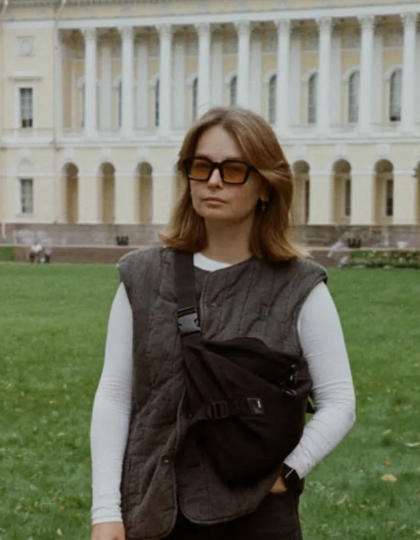
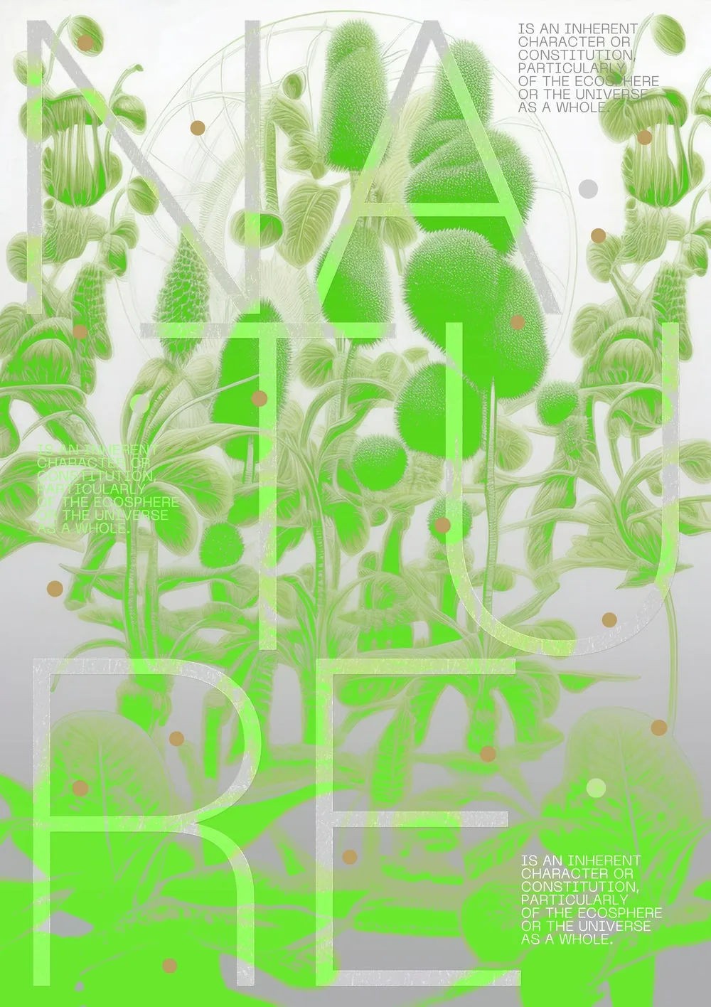
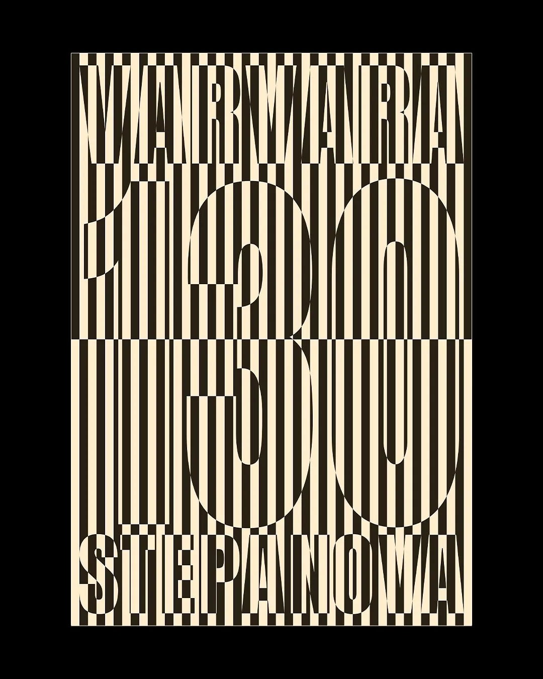
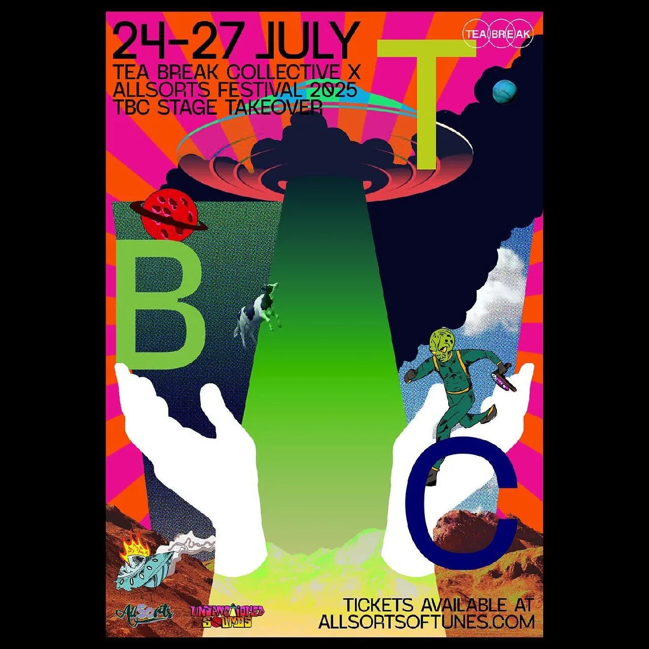
Yuliya Ratnikova carries a portable scanner the way other people carry a phone, pointing it at whatever surface stops her on the street: rust, peeling paint, the underside of a beer coaster. Those scans, plus a hoard of fruit stickers and other small collected objects, feed a poster practice built on “experiments with textures, overlays, various effects, and the use of bold colours”. “I love finding interest in the things most people walk straight past,” she has said. She is design director at the branding agency Ascend Studio, in London, and the scanner comes out well outside office hours.
That eye for the overlooked has carried her personal work into the Main Competition of the Warsaw International Poster Biennale, and onto stages at Forward Festival and the Intercontinental Biennale, with anthology credits including Bounty Hunters Posters, Slanted’s “Posters Can Help”, and Experimental Type 2.0. Poster Every Day regulars know her for “Bear with Me”, a life-sized bear built with Anna Ganna from 104 recycled Poster Every Day posters and roughly ten cubic metres of discarded plastic bottles, shown at Forward Festival Berlin in 2023. “This project isn’t just about recycling posters,” she said. “It’s about rethinking what we leave behind as designers.”
As a design leader she talks about separating ego from the brief and “structuring creative chaos” without losing the curious energy that makes early ideas good, which is what made her a subject of Design Week’s design/leader series, built around her habit of collecting road signage, care labels and IKEA manuals like other people collect stamps. “Creative Potential”, animated with Tanya Ermolaeva for the Bankov Poster School’s fifth-anniversary anthology on Times Square in June 2025, put the same eye on one of the world’s biggest screens.
Why we like it: her advice to younger designers is as spare as her posters, “strip it back and don’t over-process”, and she takes her own advice.



artist
Yuliya Ratnikova
Yuliya Ratnikova carries a portable scanner the way other people carry a phone, pointing it at whatever surface stops her on the street: rust, peeling paint, the underside of a beer coaster. Those scans, plus a hoard of fruit stickers and other small collected objects, feed a poster practice built on “experiments with textures, overlays, various effects, and the use of bold colours”. “I love finding interest in the things most people walk straight past,” she has said. She is design director at the branding agency Ascend Studio, in London, and the scanner comes out well outside office hours.
That eye for the overlooked has carried her personal work into the Main Competition of the Warsaw International Poster Biennale, and onto stages at Forward Festival and the Intercontinental Biennale, with anthology credits including Bounty Hunters Posters, Slanted’s “Posters Can Help”, and Experimental Type 2.0. Poster Every Day regulars know her for “Bear with Me”, a life-sized bear built with Anna Ganna from 104 recycled Poster Every Day posters and roughly ten cubic metres of discarded plastic bottles, shown at Forward Festival Berlin in 2023. “This project isn’t just about recycling posters,” she said. “It’s about rethinking what we leave behind as designers.”
As a design leader she talks about separating ego from the brief and “structuring creative chaos” without losing the curious energy that makes early ideas good, which is what made her a subject of Design Week’s design/leader series, built around her habit of collecting road signage, care labels and IKEA manuals like other people collect stamps. “Creative Potential”, animated with Tanya Ermolaeva for the Bankov Poster School’s fifth-anniversary anthology on Times Square in June 2025, put the same eye on one of the world’s biggest screens.
Why we like it: her advice to younger designers is as spare as her posters, “strip it back and don’t over-process”, and she takes her own advice.
No items