Anton Shlyonkin — A Logotype, a Sign, a Tarot Card
artist
Anton Shlyonkin
Before a single athlete clocks 130 kilometres an hour down an ice track, someone has to make sure the crowd can find the exit. Anton Shlyonkin designed the navigation and wayfinding system for the SANKI sliding centre built for the 2014 Winter Olympics, a genuinely high-stakes, high-traffic test for a systems thinker who now works out of Bangalore, India, across branding, motion type and design education. He has been an expert in communication design and branding at Yandex, served as Creative Director at All My T, and lectured at a national design institute, carrying a hands-on, workshop-driven approach to type and identity straight into the classroom.
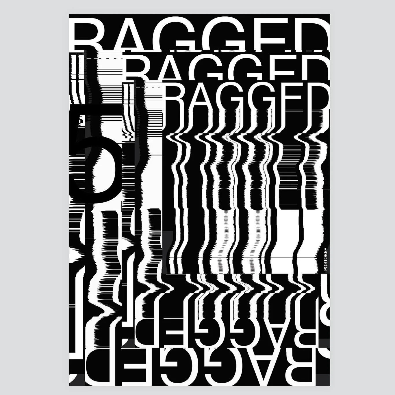
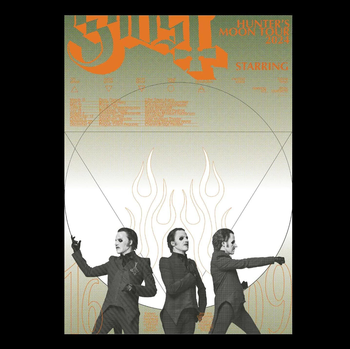
His poster-adjacent work runs through Typomania, the motion-type and typography festival, where his contributions include motion type for the 2020 edition. Alongside it sits Kinoglyph, his personal project reducing film titles to a single logotype apiece, a hand-illustrated Type Tarot deck, and French Forge, a free display typeface he released into the wild. It is the same eye doing all three jobs: strip a name, a suit of cards, or a letterform down to the minimum that still reads.
That eye wins competitions too: his packaging project “5 Principles” took a Gold A’ Design Award in 2017, a competition widely described as the world’s largest by entries, proof that the same instinct for clarity that guides a skier to the finish line also sells sweets off a shelf.
Why we like it: Shlyonkin treats a logotype, a wayfinding sign and a tarot card as the same design problem, exactly the kind of eye that travels well outside the poster frame it usually lives in.